Wildflowers on the Wall: A Folk Painting Arabesque for an Age of Scarcity
1. A 'Minhwa Lace' Woven in Two Inks The first impression this wallpaper makes is of a delicate lace — tiny flowers and vine lines filling the entire surface. Break down its structure and…

1. A ‘Minhwa Lace’ Woven in Two Inks
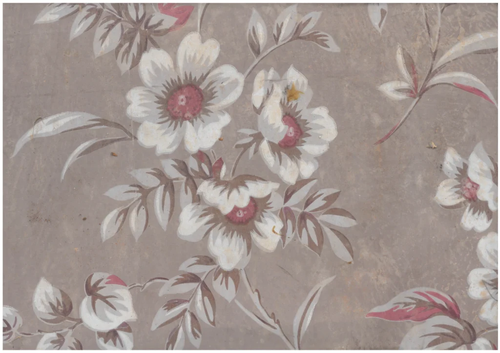
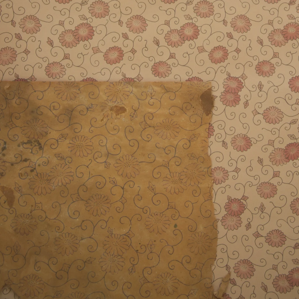
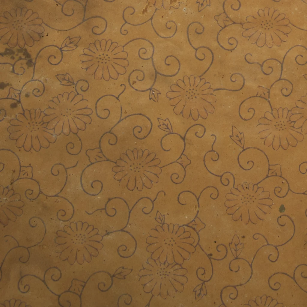
The first impression this wallpaper makes is of a delicate lace — tiny flowers and vine lines filling the entire surface. Break down its structure and it is, in fact, extremely simple: small chrysanthemum-type flowers with petals radiating outward repeat continuously, connected by slender stems in an unbroken all-over pattern. Without the skeleton of a classical format — no grid, no medallion — flexible curving lines pack the ground densely, so that the whole feels less like applied ornament than a single soft textile surface.
(Photo by Gosate 2025)
Particularly worth noting is the character of the line. The outlines of stems and flowers are drawn in a uniform thin wire line, suggesting an industrial design conceived for metal roller printing — yet the flow of those lines is anything but mechanical. There is something loose and free about them, connecting this pattern to the vine motifs casually brushed onto Joseon-era mak-sagi (blue-and-white folk ceramics) or the chrysanthemum vines of minhwa (Korean folk painting) — a quality of humble, handmade ease. In place of the compulsive filling of the refined Japanese karakusa arabesque, this composition permits breathing space between the vines, and despite being machine-printed, it reads as though drawn by hand.
(Source : Gosate Collection)
The color palette is even more extreme in its restraint: black and red — two inks, nothing more. Black lines build the entire framework; red settles lightly onto the flower petals alone, placing warm points of color across the surface. With not even a background color applied — the natural yellow of the pulp paper left bare — this limited palette paradoxically reinforces the impression that someone actually painted the wall by hand in the manner of folk painting.
2. ‘Joseon’s Arabesque’: A Consolation for an Age of Deprivation
The period just after Liberation in 1945 and through the Korean War was an era of upheaval and scarcity. In terms of design lineage, this pattern can be read as the product of Western trailing floral styles from 19th–20th century Britain and France filtering in via modern Japan — or perhaps an aspiration toward the bright, domestic atmosphere embodied by the American ditsy floral wallpaper that arrived with the U.S. Military Government.
But this wallpaper is not simply a copy of Western forms. The chronic shortage of ink and materials and the desperate state of the printing environment forced Korean makers into a discipline of radical selection. In the absence of Japanese technicians, the Korean craftsmen who remained abandoned elaborate multicolor printing and chose instead the formal language most familiar to Korean eyes — and most capable of offering psychological comfort. That language was the grammar of minhwa.
Rather than complex tonal gradation, they preserved the rhythm of line. Rather than expensive pigments, they focused on the symbolic motif of nameless wildflowers and vines. The technique may have been limited, but what filled the gaps was the modest aesthetic sensibility of ordinary people. The dense vine became a warm curtain drawn over a harsh reality; the red flowers were small talismans offered for the safety of a family.
In the end, this wallpaper is a work of self-generated design — the Western arabesque tradition of the 19th century, arriving through modern Japan, reinterpreted within the particular time and place of liberated Korea as the aesthetic sensibility of Korean folk painting. Up close, the evidence of ink shortage and worn rollers is plain to see. But within the narrow rooms of its time, this wallpaper held the lives of Korean people more warmly and tenderly than any other — and that is what it remains: a record of its era.
Copyright © 2026 Gosate Archive.
All Rights Reserved.
- All text and scholarly analysis are the intellectual property of the author.
- All photographs marked “Gosate Collection” or “Photo by Gosate” are the copyright of GOSATE. Reproduction, copying, or distribution without prior consent is strictly prohibited.
- Historical images cited from external sources are subject to their respective copyright holders or public domain provisions.
Inquiries: contact@gosate.kr
More from this era