
Ikat and Mid-Century Modern in an Early-1960s Gubdori-ji
A study of an early-1960s Korean border wallpaper where ikat-like rhythms meet mid-century modern pattern language.
First Look
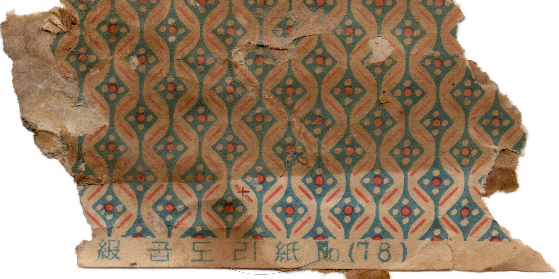
This is a gubdori-ji (굽도리지) — a strip of paper used to line the lower portion of the walls in a hanok — reproduced from an original estimated to date from the early 1960s. Earlier gubdori-ji generally rested on an all-over lattice; this one steps entirely out of that structure and is built instead on a strict vertical repeat. The units are unusually small, and the whole surface reads as a dense micro-print.

The printing is in two colors. The natural tone of the paper is left to form the pale ribbons and the surrounding negative space, while two inks — a teal and a red — are laid on top to draw the pattern. The teal covers the field broadly; the red picks out the rhythmic accents with short dashes and dots. That the two colors never overlap, each holding its own precise role, is not only a design choice but a reflection of the printing conditions of the early 1960s in Korea, when materials and cost still had to be spared. Most patterned papers of this period had to complete their aesthetic within just two ink runs.
Two Vertical Columns
The pattern is built on an A-B-A-B structure — two kinds of vertical columns alternating in strict repeat.
Column A — Two ribbons wind around each other as they flow downward. One swells to the left as the other swells to the right, generating a wave. This kind of gesture rarely appears in the all-over lattice wallpapers that came before; rather, the downward flow feels closer to the rhythm that arises naturally along the warp direction of woven cloth.
Column B — Four small red dots arranged in a diamond form a single unit, framed above and below by short diagonal dashes set in symmetry. The pairing of diamond and dot is a formula that recurs, again and again, across weaving traditions around the world.
Seen together, the two columns place this paper not within the lineage of wallpaper, but within the lineage of woven cloth.

The Vocabulary of Ikat: Diamond, Wave, Dot
Flowing vertical waves, diamonds set between them, and dots repeated at regular intervals — this combination has been formalized across weaving traditions worldwide, especially in ikat, the resist-dye technique in which threads are bound and dyed before being woven. Ikat designs are almost entirely geometric: diamonds, stepped forms, chevrons, zigzags, and dots dominate the vocabulary. The reason curves are rare, and grid-based forms prevail, is straightforward — dyeing the threads first and then weaving them into a lattice makes straight lines and repeating grids the most natural outcome, while curves demand extraordinary precision.

Cotton, plain weave; resist-dyed (ikat), ink, and gold. An example of the geometric vocabulary of Yemeni ikat, characterized by repeating chevrons and diamond motifs. The Metropolitan Museum of Art, Gift of George D. Pratt, 1929, 29.179.10. Public Domain.
Two regional traditions in particular sit close to the sensibility of this gubdori-ji. Central Asian ikat (Uzbek and Tajik) takes bold diamonds and chevrons as its primary vocabulary, and its palette has long been restrained to indigo, red, and cream. Those three colors map almost directly onto the teal, red, and paper-tone of the paper in front of us. Japanese kasuri (絣), the Japanese branch of ikat, is often summarized as “tight repeat units, small geometric marks, and carefully controlled negative space” — indigo and white in contrast, small geometric marks arranged with rhythm. That sensibility sits at the same scale as the micro-print of this gubdori-ji.
What Art Deco Absorbed
The paper did not, of course, come directly from Uzbekistan or Japanese kasuri. Between those origins and this wall stands a decisive current from the first half of the twentieth century — the moment when these weaving vocabularies from around the world were consolidated into a single aesthetic: Art Deco.
The Art Deco of the 1920s and 30s emerged as a reaction against the organic curves of Art Nouveau, absorbing wholesale the tribal and geometric idioms of Egypt, the Aztec world, Africa, Central Asia, and East Asia. Chevrons, zigzags, stepped forms, diamonds, vertical stripes, sunbursts — every one of these entered the standard vocabulary of Art Deco. Its symmetrical, rhythmic geometry spread across every kind of surface, from building façades to furniture, textiles, and wallpaper.
Mid-Century Modern: The Age of the Small Repeat
The geometric idiom of Art Deco carried forward into the Mid-Century Modern textile fashions of the 1950s and 60s, and from there it was popularized globally. During these decades, dense micro-prints appeared on an unusually wide range of surfaces — small garments and accessories like shirts, ties, scarves, and cravats; home textiles like curtains, sofa covers, cushions, linings, and wallpaper; and even the finishing papers of boxes and furniture. Any hand-scale surface, it seems, might carry this kind of small repeat.
An Early-1960s Korean Place
The moment this gubdori-ji was made was one of rapid Westernization in Korean society. The First Five-Year Economic Plan had just been launched (1962), Western tastes in domestic space were spreading beyond the upper classes to the middle class, and American and European textile trends were entering the visual culture of the city through newspapers, magazines, and imported goods. Where an earlier gubdori-ji held to neunghwa-mun — the older Korean vocabulary of patterned paper — this one gives that same place over to the vocabulary of international textile fashion.

(Source: Gosate Collection)
Here is where the gubdori-ji takes on its dual character. The design itself is an internationalized idiom, one that began in weaving traditions across the world and passed through Art Deco and Mid-Century Modern textiles on its way here. But the place where the design finally comes to rest is the lower wall of a Korean hanok. Micro-prints of this kind were not entirely absent from Western wallpaper, but of all the surfaces such a pattern might have found, its arrival at gubdori — the base of the wall, the zone most touched by hands — is a distinctly Korean sensibility of place. The aesthetic of the small textile repeat has changed both its medium and its position, becoming, in two ink runs on paper, a new kind of finishing material for the base of a room.
Two ribbons wind around each other, and between them four red dots form a diamond as they flow downward. On these two runs of ink over paper, the geometry of Art Deco, the rhythm of Mid-Century Modern, and — further back still — the older patterns of ikat lie folded, one atop the other.
Copyright © 2026 Gosate Archive.
*본 콘텐츠의 저작권은 **고사테(Gosate)*에 있으며, 저작권법의 보호를 받습니다.
- All text and scholarly analysis are the intellectual property of the author.
- 사진 자료: ‘Gosate Collection’ 및 ‘Photo by Gosate’로 표기된 모든 실물 촬영 이미지의 저작권은 고사테에 있습니다. Reproduction, copying, or distribution without prior consent is strictly prohibited.
- Historical images cited from external sources are subject to their respective copyright holders or public domain provisions.
Inquiries: contact@gosate.kr
Wallpaper from this research
Gumi
1960s
GOSATÉ restores forgotten patterns as wallpapers for contemporary spaces through the collection, documentation, and study of historic originals. A portion of every reproduction sale supports the continuing discovery, preservation, and research of Korean wallpaper.
- Colorways
- Original
- Material
- Non-woven / Peel & Stick
- Sizes
- 50×6m / 50×10m / 50×244cm
- Delivery
- Approx. 3-5 days · Free shipping

More from this era