Maple Leaves on Silver Gray — Western Botanical Grammar in Early 1960s Korean Wallpaper
With stippled leaves, fern silhouettes, and layered tones from only two inks, this early 1960s wallpaper shows how Korean printing absorbed Western botanical wallpaper traditions.
A Botanical Composition
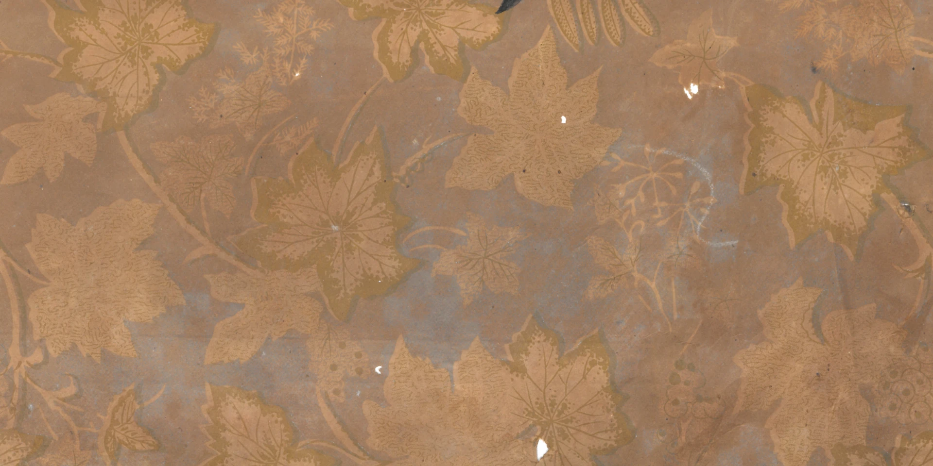
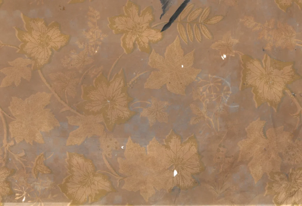
Leaves of several kinds are scattered over a silver-gray ground. Large five-lobed leaves, perhaps maple or grape, occupy the center. Smaller compound leaves sit near the edges, while loose fern silhouettes drift in the background. This is not the depiction of a single plant, but a botanical composition in which several plant forms coexist.
Two Inks, Four Tones
The wallpaper is printed in two colors: a silver-gray ground and an olive-gold contour ink. The warm brown tone that appears in parts of the pattern is not a third ink, but the exposed color of the kraft pulp paper.
With only two inks, the design creates four tones: silver gray alone, olive gold alone, the darker overlap of the two, and the untouched paper. These tones give the surface more depth than the limited palette would suggest.
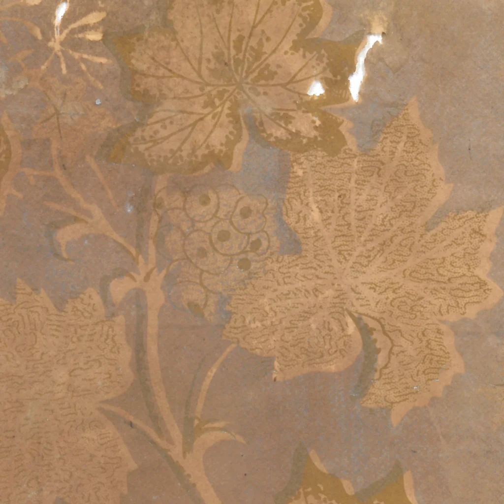
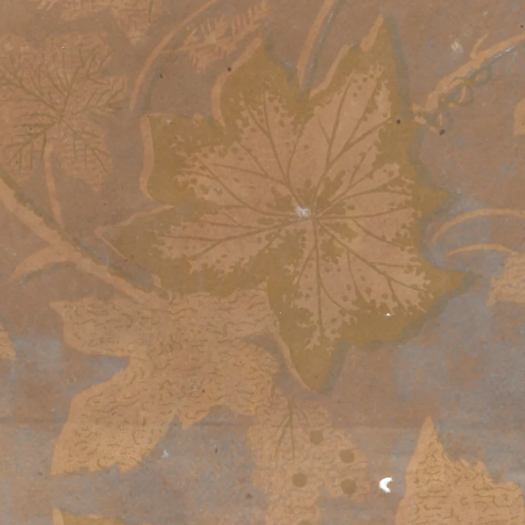
The most important technique is stippling. The large leaves are not filled as solid shapes; they are built from many small dots. This kind of fine texture points toward engraved or gravure-like printing, rather than a rough block-printed surface.
A Western Botanical Lineage
The overall structure belongs to the Western botanical wallpaper tradition. Since the nineteenth century, European wallpapers often arranged leaves, ferns, and fruit as if gathered from a botanical plate and spread across a wall.
In this Korean example, that tradition is not copied mechanically. It is absorbed into local material conditions: kraft paper, two-color printing, and a restrained palette. The result is neither purely European nor traditionally East Asian. It is a Korean printed surface learning to speak the language of Western botany.
Depth from Scarcity
The design looks richer than its printing method suggests. With only two inks and the exposed color of the paper, it creates foreground, background, shadow, and highlight. This is not accidental. It depends on a careful use of overlap and omission.
The untouched kraft ground becomes the warmest tone. The silver-gray ground cools the surface. Olive-gold lines define leaf veins and edges. Where inks overlap, the tone deepens. The result is a layered botanical field made from a very small number of material components.
Stippling and Printed Touch
The stippled leaves are especially important. Instead of filling a leaf as a flat silhouette, the printer builds it from dots. This gives the leaf a soft internal texture, closer to engraved illustration than to bold stencil printing.
Such details suggest a desire to imitate printed botanical plates, where leaf structure, vein, and surface are studied carefully. Yet the wallpaper is not scientific illustration. It uses that visual authority for atmosphere.
Botanical Wallpaper in Korea
Western botanical wallpaper often brought gardens, herbariums, and illustrated plant books into domestic rooms. In this Korean example, the same grammar appears under different material conditions. It is quieter, more restrained, and more economical.
The paper shows how Korean wallpaper in the early 1960s was absorbing not just foreign motifs, but foreign ways of organizing nature. Leaves become specimens, silhouettes, layers, and repeated decorative evidence.
Copyright © 2026 GOSATÉ Archive. All Rights Reserved.
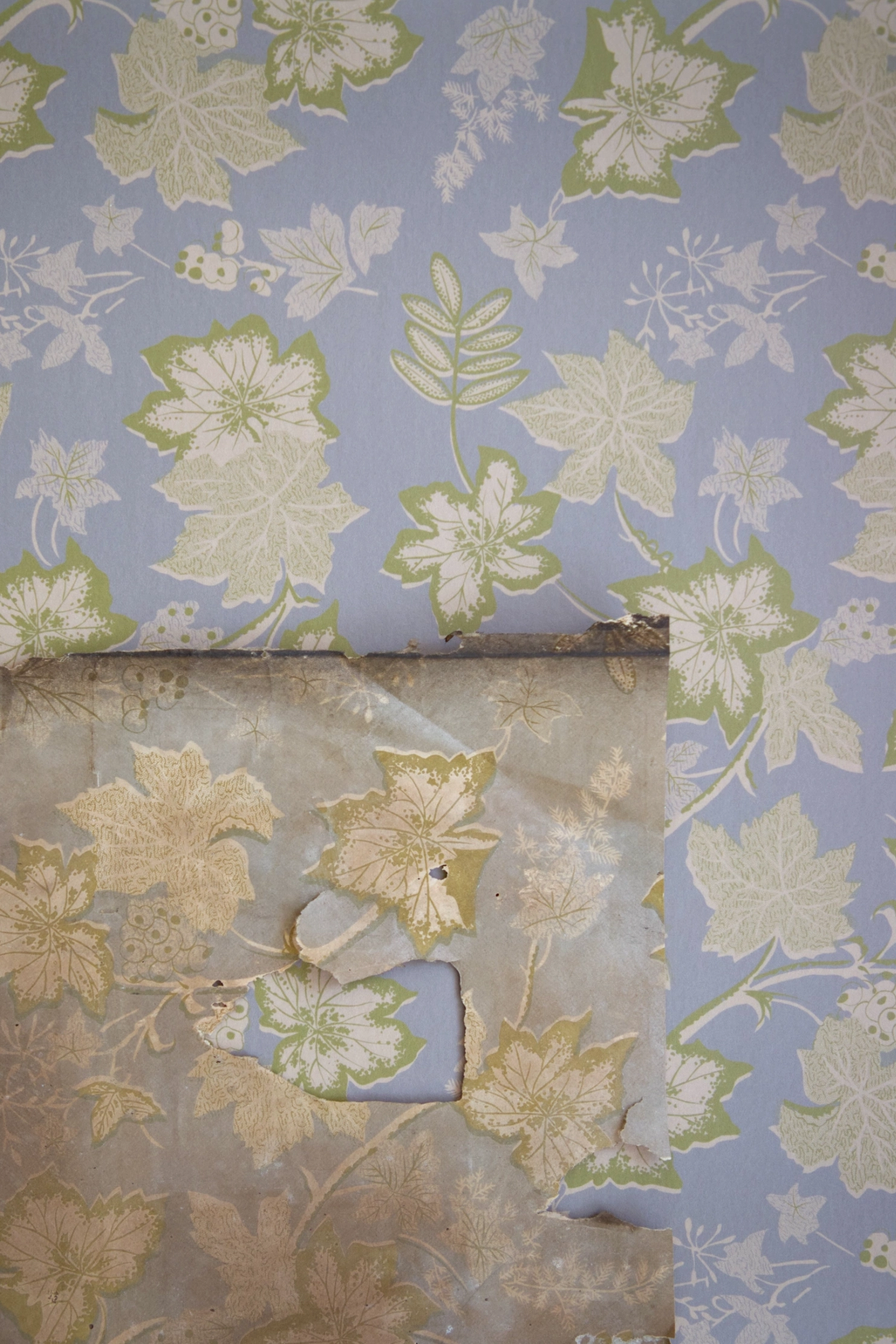
Wallpaper from this research
Sungmin
1960s
GOSATÉ restores forgotten patterns as wallpapers for contemporary spaces through the collection, documentation, and study of historic originals. A portion of every reproduction sale supports the continuing discovery, preservation, and research of Korean wallpaper.
- Colorways
- Original
- Material
- Non-woven / Peel & Stick
- Sizes
- 50×6m / 50×10m / 50×244cm
- Delivery
- Approx. 3–5 days · Free shipping
More from this era