Geometry Beneath Double Happiness — Tradition and Modernity in an Early 1960s Ceiling Paper
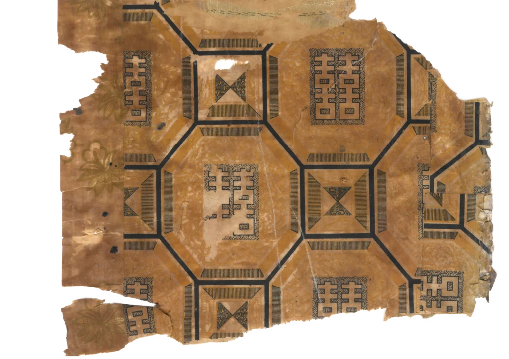
This early 1960s Korean ceiling paper places the auspicious Double Happiness character inside a precise octagonal grid, where traditional symbolism meets modern graphic construction.
The Structure of the Ceiling
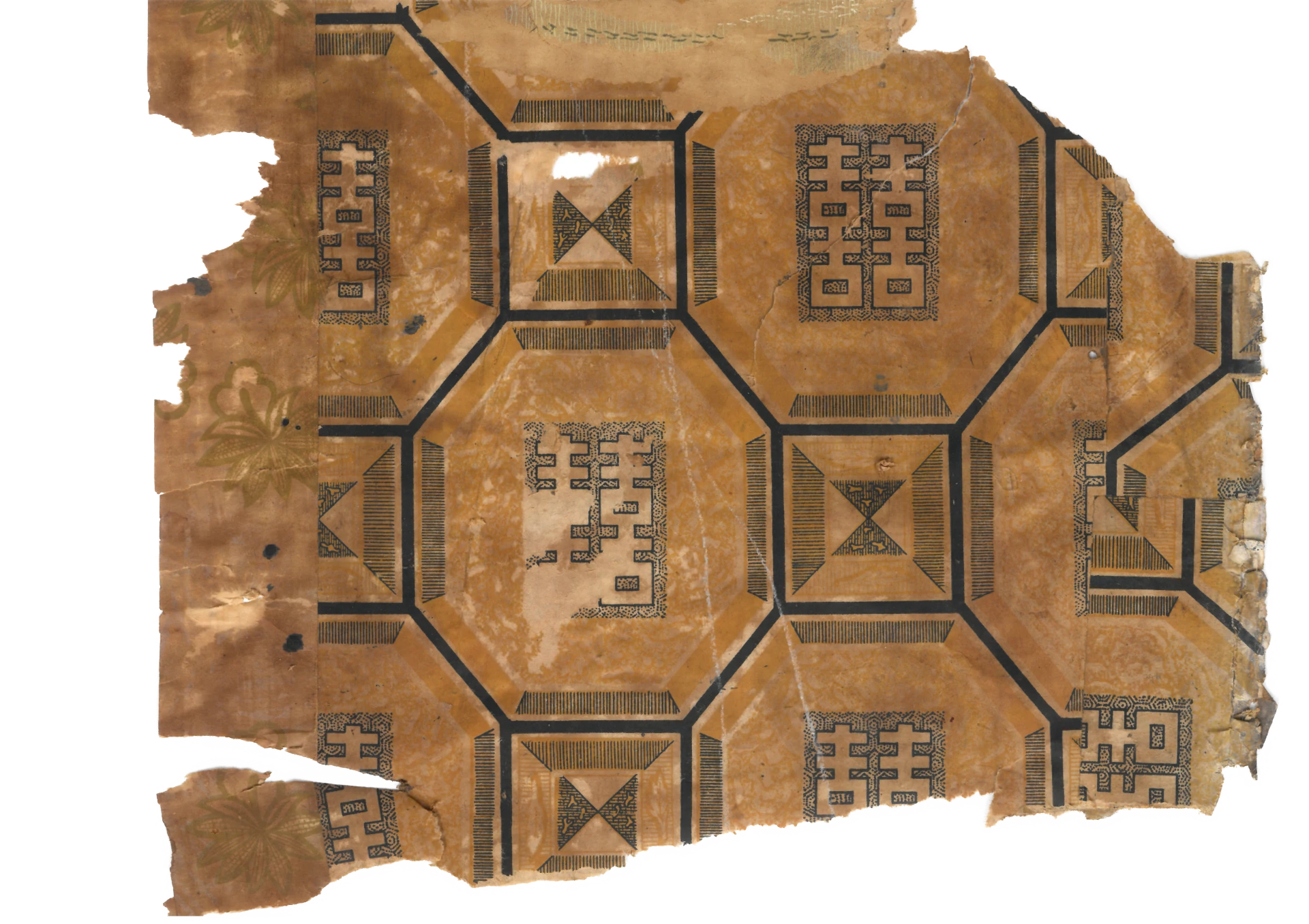
This ceiling paper is built from two interlocking grid systems. Large octagons occupy the main field, while small squares fill the spaces between them. The alternation of octagon and square creates a seamless geometry that can expand across a ceiling without interruption.
At the center of each octagon sits the Double Happiness character, 囍. Formed from two characters for joy, it has long symbolized marriage and celebration across East Asia. The smaller squares contain crossed divisions and smaller versions of the same auspicious sign.
The paper is printed in two colors: a dark navy ink over a yellow-brown ground.
Five Textures in a Limited Field
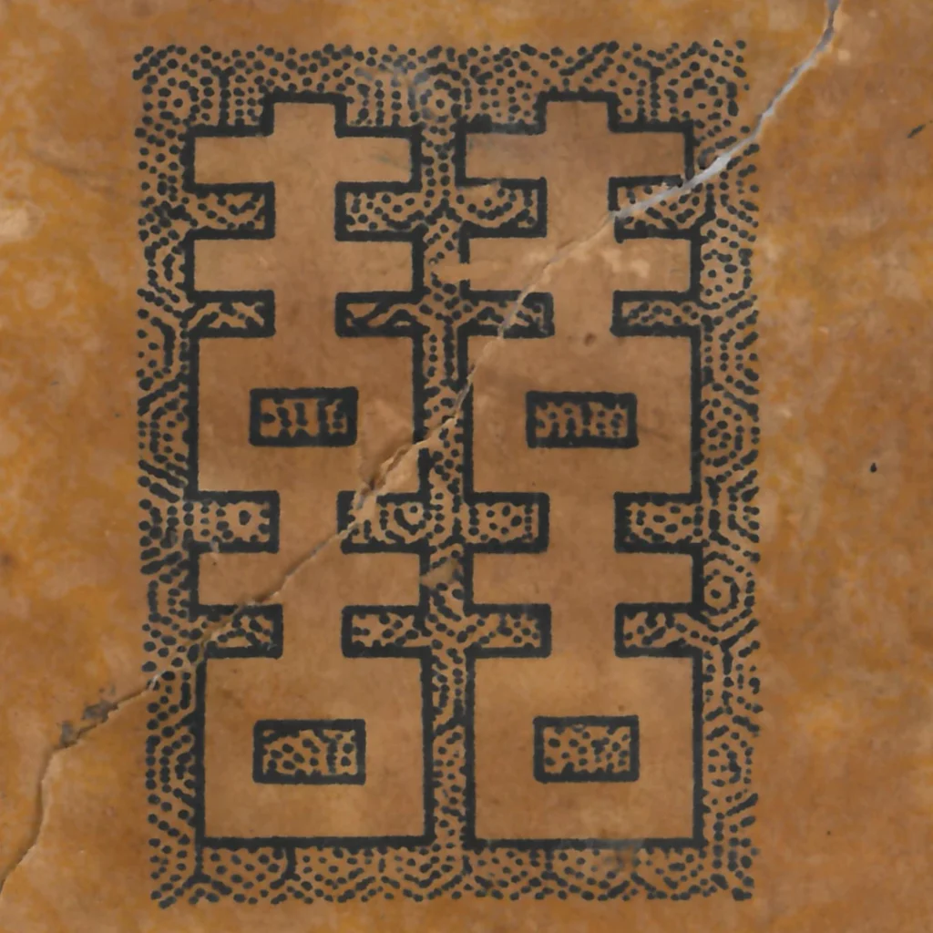
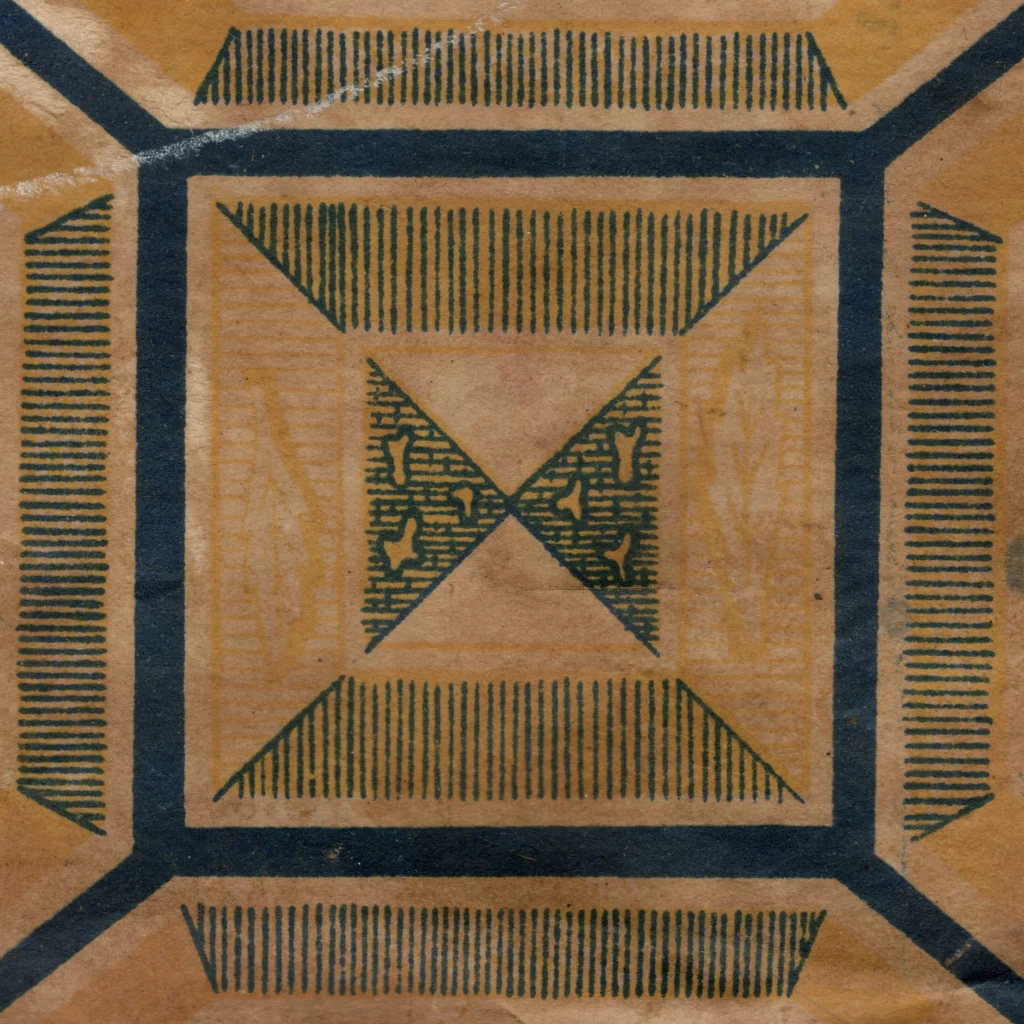
What makes this design remarkable is its use of texture. Around the Double Happiness character, tiny stippled dots create depth. Vertical hatching fills the bands around the octagons. Horizontal hatching appears inside the small squares. Diagonal hatching directs the eye toward the center. Solid dark areas anchor the composition.
In other words, the design produces visual richness without adding more colors. It changes the direction, density, and rhythm of line to create separate surfaces within a single ink.
Auspicious Symbols, Modern Construction
The Double Happiness character belongs to a long vernacular tradition of wedding and household decoration. Yet the way it is placed here is highly modern: repeated, gridded, abstracted, and turned into a modular ceiling system.
The wallpaper does not simply preserve tradition. It reorganizes auspicious symbolism through the logic of industrial printing. The ceiling becomes a field where inherited signs and modern geometry meet.
Texture as Ornament
The ceiling paper uses texture almost as a substitute for color. Stippling, vertical hatching, horizontal hatching, diagonal hatching, and solid dark fields each create a different surface. The viewer reads these textures as separate materials even though they are produced by the same ink.
This is a clever solution for economical printing. A limited palette does not have to mean a flat image. By changing the direction and density of lines, the printer gives the design movement, depth, and hierarchy.
The Double Happiness Character
The character 囍 is deeply associated with marriage and celebration. It is often placed on doors, furniture, textiles, paper cutouts, and wedding objects across East Asia. In this ceiling paper, the character is removed from a single ceremonial object and multiplied across an entire architectural surface.
That multiplication changes its effect. It is no longer only a sign placed at one focal point. It becomes the organizing unit of the whole ceiling, turning auspicious meaning into a pattern system.
Ceiling Paper as Modern Vernacular Design
The design is neither purely traditional nor purely modern. Its symbol is old; its grid is modern. Its meaning comes from household custom; its form comes from industrial repetition. That mixture is exactly what makes it a useful document of early 1960s Korean interiors.
In ordinary houses, modernity did not always arrive through radically new imagery. Sometimes it arrived by reorganizing familiar signs through new production methods.
Copyright © 2026 GOSATÉ Archive. All Rights Reserved.
Wallpaper from this research
Yungtaek
1960s
GOSATÉ restores forgotten patterns as wallpapers for contemporary spaces through the collection, documentation, and study of historic originals. A portion of every reproduction sale supports the continuing discovery, preservation, and research of Korean wallpaper.
- Colorways
- Original
- Material
- Non-woven / Peel & Stick
- Sizes
- 50×6m / 50×10m / 50×244cm
- Delivery
- Approx. 3–5 days · Free shipping

More from this era