
Flowers on a Purple Ground — Korean Wallpaper from the Late 1960s to Early 1970s
A lilac-gray ground, painterly flowers, and richer color layers mark a stylistic shift in Korean wallpaper from dense two-color patterning toward softer pictorial decoration.
Visual Observation
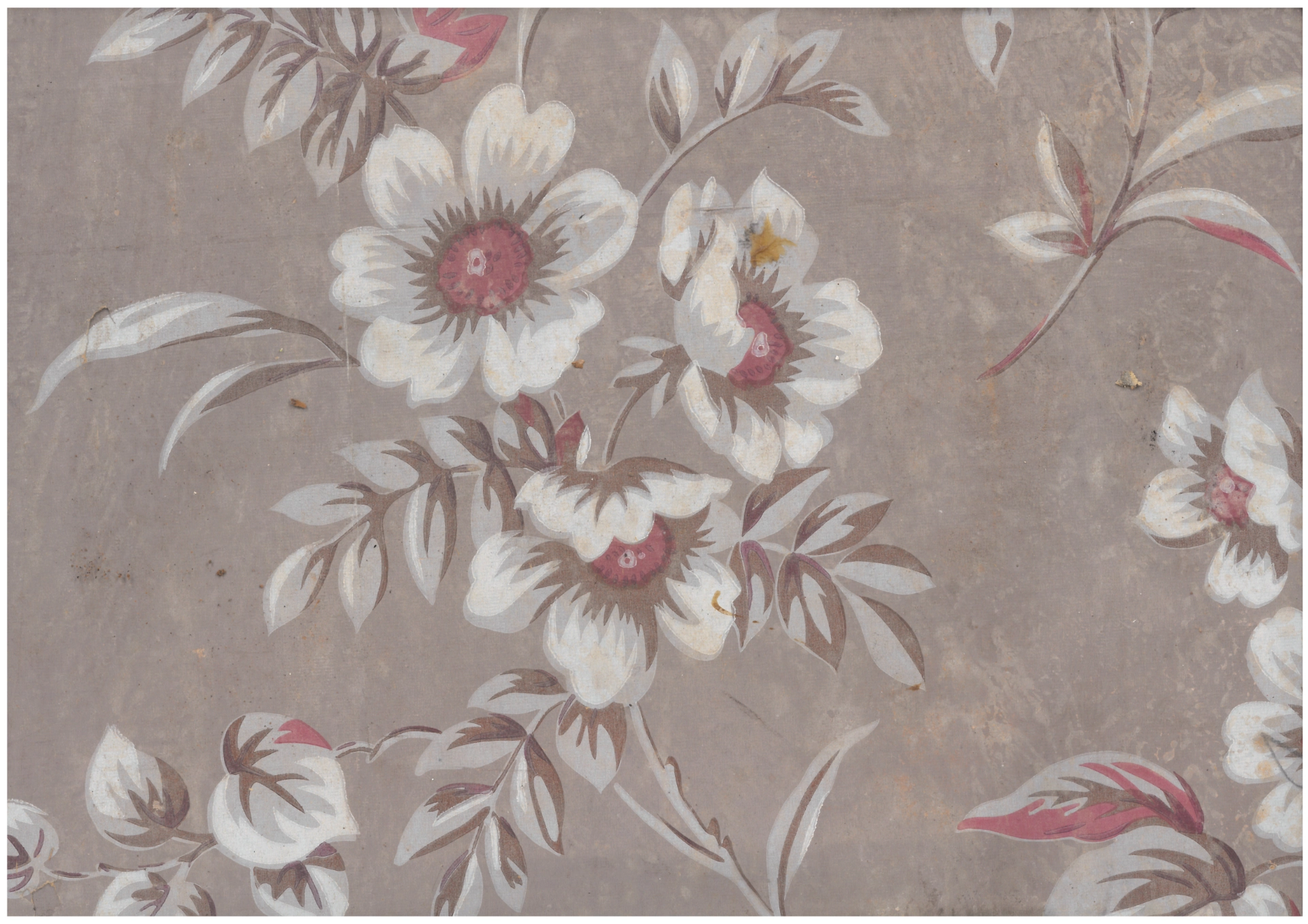
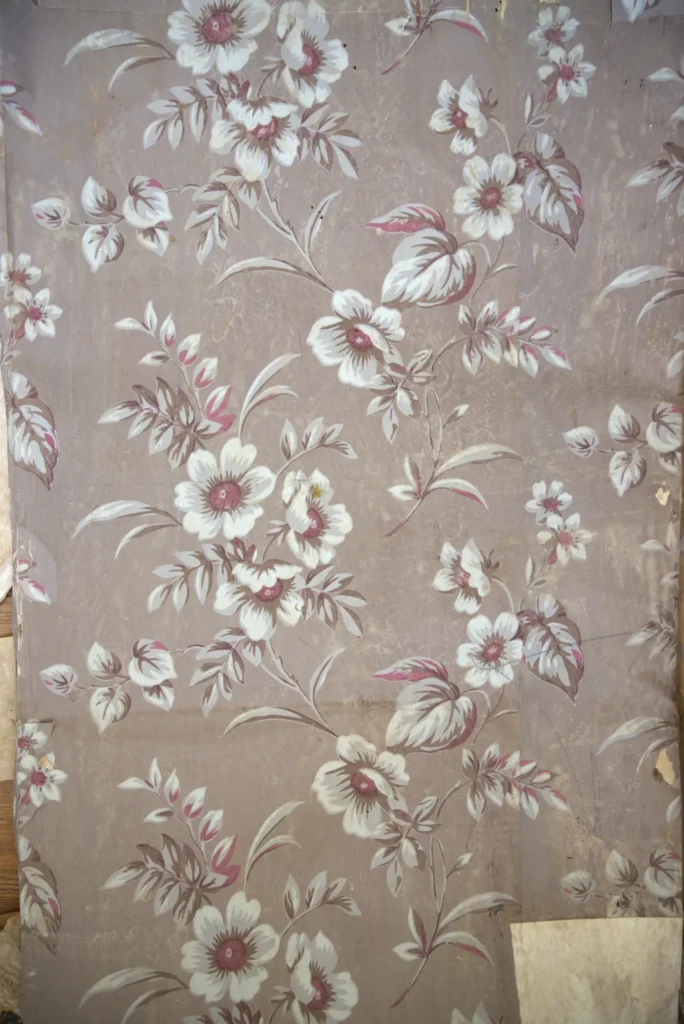
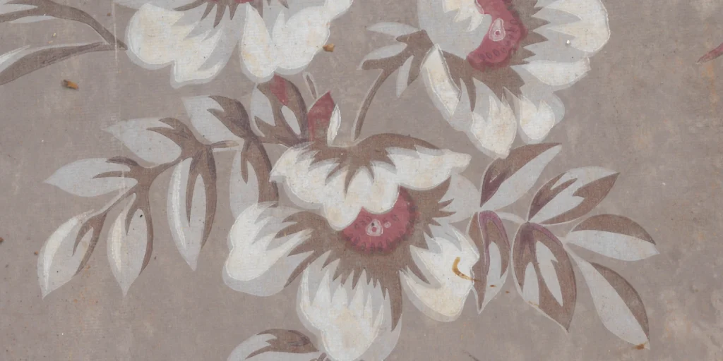
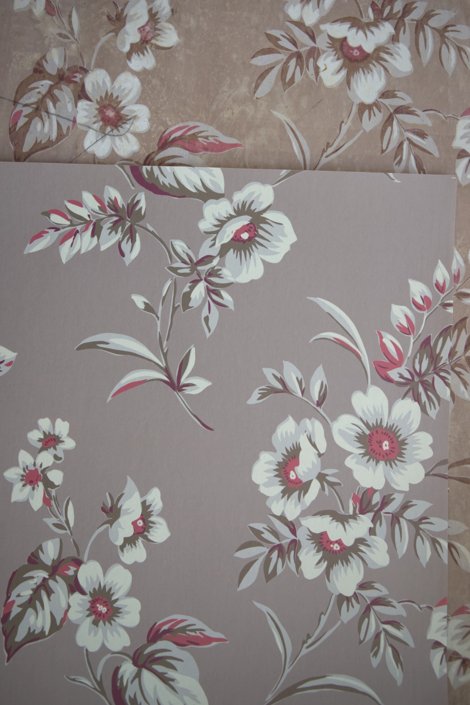
This wallpaper begins with a pale purple, almost lilac-gray ground. Over it, flowers and leaves are printed in three colors. Including the ground, the surface contains four visual layers: purple, white petals, dark brown outline and shadow, and pink accents.
The main motif is a large five-petal flower surrounded by heart-shaped leaves, willow-like leaves, and small buds. The stems curve across the field, giving the pattern a calm, organic rhythm.
A Painterly Surface
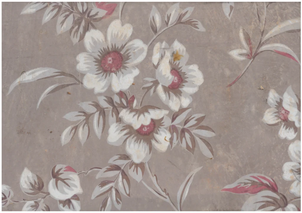
The flowers look as if they were drawn with a brush. White petals are not flat shapes; brown shadows and pink highlights create volume. The leaves are edged with slightly rough lines, giving the surface a hand-drawn feeling even though it is printed.
This painterly quality distinguishes the paper from earlier Korean wallpapers, which often relied on dense small motifs, stippling, hatching, and economical two-color printing.
A Shift in Style
By the late 1960s and early 1970s, Korean wallpaper began to move toward colored grounds and softer, more pictorial decoration. Instead of building richness through microscopic detail, designs increasingly used larger motifs, fuller color, and atmospheric surfaces.
This wallpaper stands at that point of transition. It still belongs to inexpensive printed paper culture, but its aspiration is different: less diagrammatic, more domestic, more decorative, and closer to the visual language of the modern living room.
Color as a New Priority
Earlier Korean wallpapers often achieved richness through density: many small lines, dots, and motifs printed with only one or two inks. This wallpaper works differently. It begins with color. The lilac-gray ground already gives the room a mood before the flowers appear.
The white petals, brown shadows, and pink accents then build a soft pictorial surface. The pattern is less about precise ornamental construction and more about atmosphere.
The Living Room Turn
This shift corresponds to changes in Korean domestic space. By the late 1960s and early 1970s, the modern living room became increasingly important. Wallpaper was expected not only to cover walls but to create comfort, color, and taste.
Floral motifs became larger and softer. They no longer needed to behave like small all-over textiles. They could read as painted decoration for a modern home.
Between Economy and Desire
The wallpaper is still economical. It is printed paper, not expensive fabric or hand painting. But it uses that economy to imitate a more painterly, colored interior world. Its charm comes from that tension: modest material, ambitious mood.
Placed in a room, it would have softened the wall and given it a fashionable warmth. It marks the moment when Korean wallpaper began to think more visibly in color.
Copyright © 2026 GOSATÉ Archive. All Rights Reserved.
Wallpaper from this research
Miran
1960s
GOSATÉ restores forgotten patterns as wallpapers for contemporary spaces through the collection, documentation, and study of historic originals. A portion of every reproduction sale supports the continuing discovery, preservation, and research of Korean wallpaper.
- Colorways
- Original
- Material
- Non-woven / Peel & Stick
- Sizes
- 50×6m / 50×10m / 50×244cm
- Delivery
- Approx. 3–5 days · Free shipping
More from this era