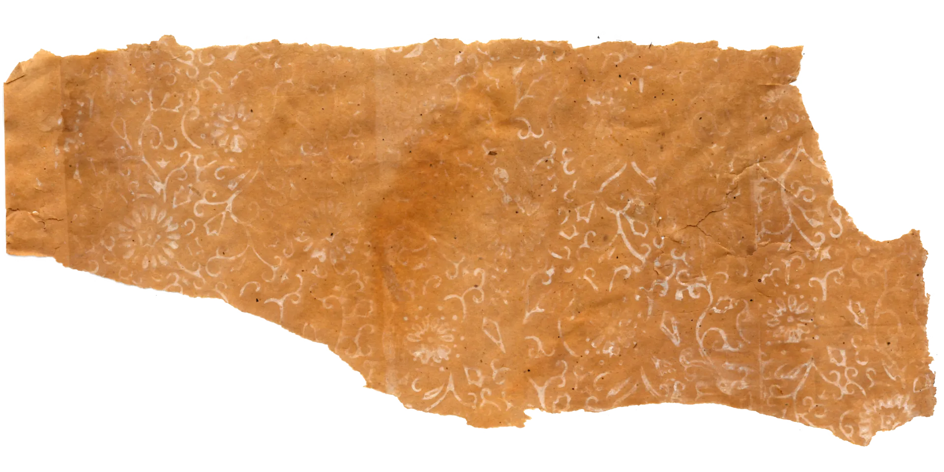
1. Structure and Ornament: A Western Classical Grammar Reinterpreted and Transformed
The most defining structural feature of this pattern begins with a continuous grid of diamond-shaped frames. This is a form that simplifies and combines the ogee curve — frequently encountered in medieval European architecture and Islamic ornament — with the quatrefoil, a four-lobed leaf shape, adapting both to Korean sensibility and the constraints of mass printing. Within this geometric framework, curved frames interlock endlessly along shared edges, dispersing the eye across the entire ceiling surface. The result is a visual rhythm imposed on a flat plane, and an optical effect that makes the ceiling read as larger than it actually is.
The detail motifs filling each frame symbolically embody the refined Western sensibility that Korean society of the time was aspiring toward. At the center of each unit sits a star- or flower-shaped rosette, surrounded by abstract, fluid scrollforms evoking plant stems. These ornaments, originally derived from Baroque and Rococo tradition, have been resolved into bold, clear lines and masses optimized for early Korean mass-production processes. The emphasis falls not on intricate hand-crafted detail but on the visual richness generated by area and repetition — a result that simultaneously met the popular demand accompanying Korea’s rapid housing expansion and the demands of industrial production efficiency.
(Photo by Gosate 2025)
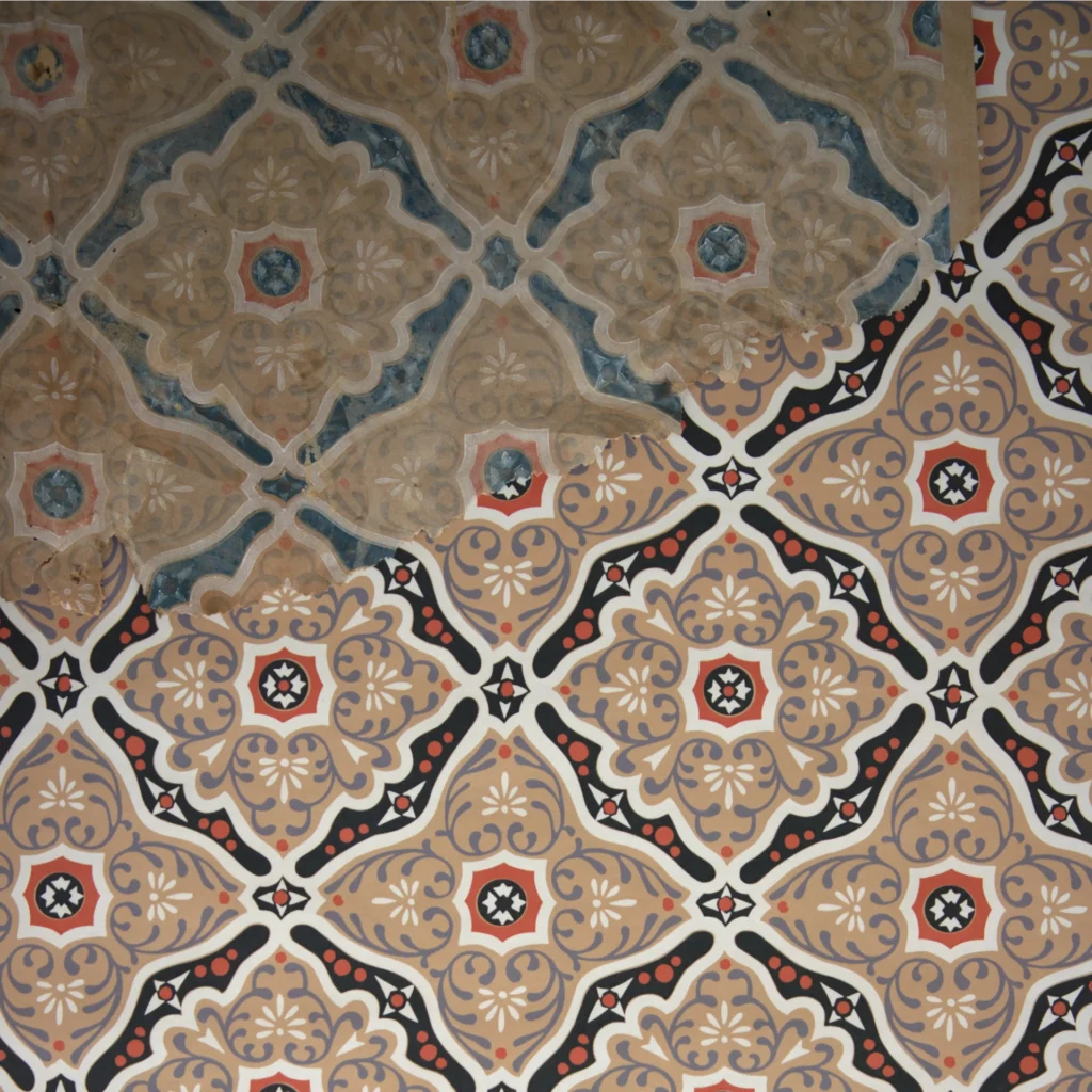
2. Materiality and Illusion: The Three-Dimensional Trompe l’Oeil of Industrial Rationality
The interior ornament tends not toward representational flowers or leaves but toward a semi-abstract arabesque — overlapping blurred scrolls and spirals. This is a style commonly seen in 19th–20th century European floor tiles, linoleum, and wrought-iron balustrades: rigid geometric grids softened by fluid curves laid over them. The dark circular motif stamped at the center of each diamond, encircled by a gilt ring, evokes gem setting or a metal stud — a visual reproduction of a costly metal inlay tile, achieved using nothing but thin gold foil and ink in place of actual metal.
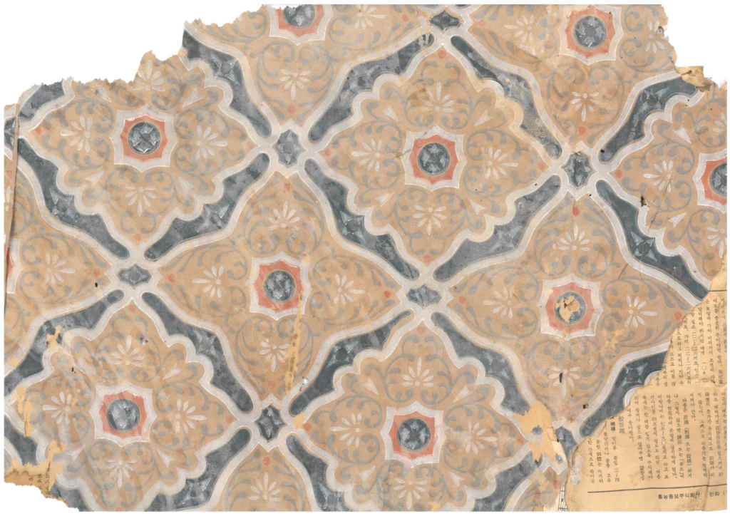
(Source : Gosate Collection)
The decisive element that determines this ceiling paper’s visual accomplishment is its use of color contrast to generate a trompe l’oeil of three-dimensionality. The deep blue-grey and reddish-brown lines laid over the natural tone of the pulp paper ground assert themselves through powerful contrast. The heavy blue-grey lines in particular cast an artificial shadow on the flat paper surface, creating a quasi-virtual molding effect — as though the ceiling has received actual plaster molding or relief ornament. It is the essence of a design strategy that is at once deeply aesthetic and profoundly economical: dramatically elevating the dignity of a space with a single sheet of paper, without any costly building material.
The 1970s, when this design was produced, was the period in which ceiling wallpaper became fully mainstream in Korean domestic culture. The improved hanok and Western-style apartment buildings proliferating across the country aspired toward a Western interior atmosphere, and ceiling-specific wallpaper was the key material through which this aspiration was economically realized. This wallpaper is among the most faithful expressions of that historical demand.
Copyright © 2026 Gosate Archive.
All Rights Reserved.
- All text and scholarly analysis are the intellectual property of the author.
- All photographs marked “Gosate Collection” or “Photo by Gosate” are the copyright of GOSATE. Reproduction, copying, or distribution without prior consent is strictly prohibited.
- Historical images cited from external sources are subject to their respective copyright holders or public domain provisions.
Inquiries: contact@gosate.kr