From the European Diaper Pattern to the Korean Ceiling Paper: The Translation and Rebirth of an Ornamental Vocabulary
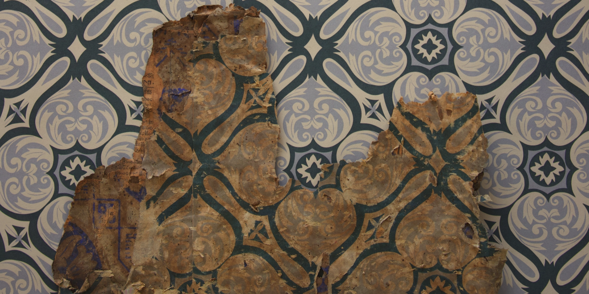
1. A Pattern Between Tile and Paper This wallpaper arrives at first glance like a structure built from curves. Bold black curved lines divide the entire surface into an X-shaped grid, and at each…
1. A Pattern Between Tile and Paper
This wallpaper arrives at first glance like a structure built from curves. Bold black curved lines divide the entire surface into an X-shaped grid, and at each node the lines bow gently outward, forming a curved frame that evokes a four-leaf clover. The overall impression is of looking down at a decorative elevation drawing of a cast-iron balustrade or wrought-iron window grille from a Western building.
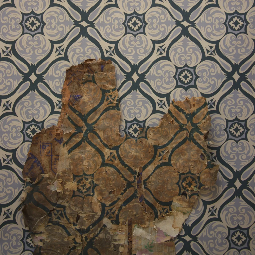
(Photo by Gosate 2025)
The interior of each frame is filled with a near-silver grey, and acanthus motifs within the remaining ground spiral gently, creating a shallow sense of depth. These are not plant motifs specific enough to be called flowers — they are better understood as simplified descendants of the arabesque and acanthus forms that recurred throughout 19th–20th century Western ornament. The black rosettes set at each crossing point where four leaves meet, and the small diamond motifs stamped at intervals throughout the grid, call to mind metal rivets or decorative nailheads.
As all these elements overlap, the result is a hybrid impression — despite the material being nothing but paper, the viewer cannot quite decide whether this is tile, stone panel, plaster relief, or wrought iron. In a single sheet of wallpaper, structure and ornament, and the surface qualities of multiple materials, are simultaneously on display.
2. The Lineage of the ‘Western Tile’ in 1960s Korean Ceiling Paper
In late 19th-century Britain and France, a grid-format diaper pattern — placing small flowers or scrolls within diamond or clover-shaped frames — was widely fashionable. At the same time, cement and mosaic tiles deployed similar grids, stars, and rosette compositions in repetition. During the Japanese colonial period, when Western decorative vocabulary entered Korea through Japanese mediation, these designs were translated into wallpaper, linoleum flooring, and wrapping paper — and the custom of covering hanok ceilings with dense geometric patterns became established in this era.
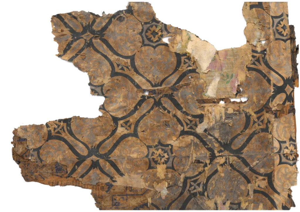
(Source : Gosate Collection)
Entering the 1960s, after liberation and war, Korean manufacturers no longer simply reproduced imported designs wholesale — they began to consolidate and summarize that lineage in their own way. This wallpaper is precisely such a product of its historical moment. It retains the clover grid structure familiar from the colonial-era tile-style ceiling papers, while reducing the palette to a clean two-color print in black and grey. The Western quatrefoil motif, it should be noted, bears a striking resemblance to the juhwamun (주화문) — the persimmon-calyx pattern of the Joseon decorative tradition.
Produced as a two-color print on paper, the material itself is modest — yet the intent is clearly to create the effect, when viewed from below, of a ceiling in plaster relief or decorative tile evoking the lobby of a Western hotel or the interior of a theatre. This single sheet of ceiling paper is the outcome of multiple histories crossing and combining: Western ornamental vocabulary, the process of its absorption during the Japanese colonial period, and the image of the modern interior that 1960s Korea was aspiring toward.
Copyright © 2026 Gosate Archive. All Rights Reserved.
All Rights Reserved.
- All text and scholarly analysis are the intellectual property of the author.
- All photographs marked “Gosate Collection” or “Photo by Gosate” are the copyright of GOSATE. Reproduction, copying, or distribution without prior consent is strictly prohibited.
- Historical images cited from external sources are subject to their respective copyright holders or public domain provisions.
Inquiries: contact@gosate.kr
More from this era