From Palace to Province: The Art Deco Chrysanthemum Wallpaper That Crossed Asia
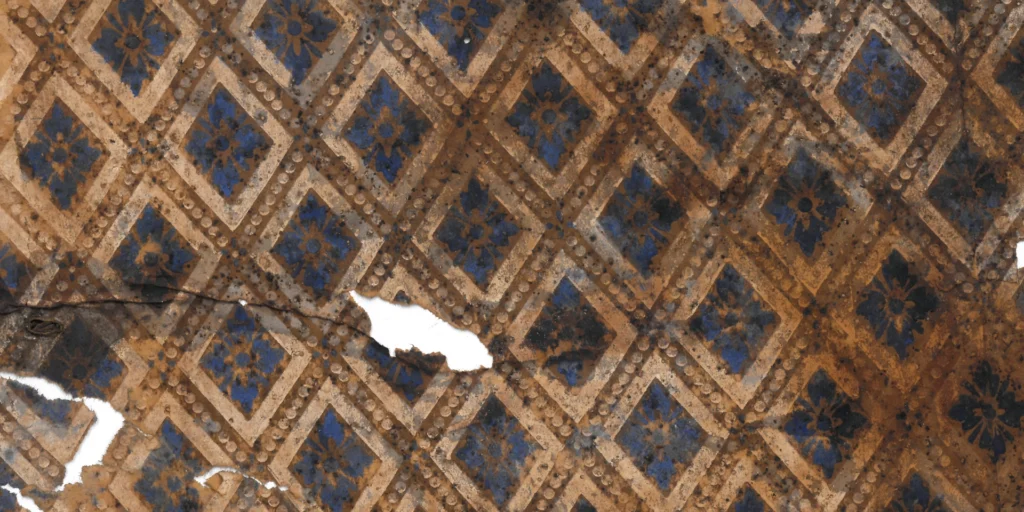
1. The Grammar of an Era: Translating a Neo-Gothic Skeleton into Art Deco The first sensation this wallpaper delivers is one of solidity and flatness. The Neo-Gothic style that once decorated 19th-century European cathedrals…

1. The Grammar of an Era: Translating a Neo-Gothic Skeleton into Art Deco
The first sensation this wallpaper delivers is one of solidity and flatness. The Neo-Gothic style that once decorated 19th-century European cathedrals and aristocratic residences originally prized deep shadow and three-dimensional relief. But crossing into the 20th century, this heavy ornamental tradition encountered a new visual grammar — Art Deco — and was transformed into something entirely different.
The wallpaper’s structural skeleton — a star cross and quatrefoil — is unmistakably a legacy of medieval Gothic. Yet this wallpaper boldly strips away the complex curves and volumetric mass characteristic of the Gothic, replacing them with straight lines and geometric forms that read as though drawn with compass and ruler. Where the Gothic quatrefoil was a curve reaching toward God, the grid of this wallpaper displays the standardized aesthetic of the machine age. It is Neo-Gothic heritage compressed — through the modernizing filter of Art Deco — into a refined tile pattern.
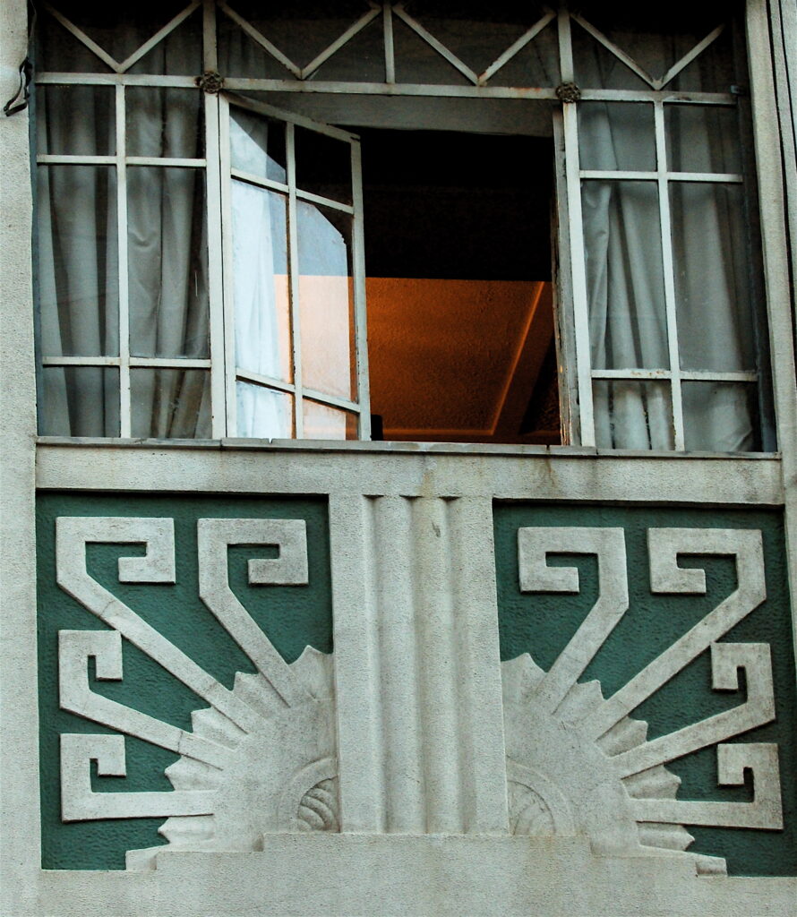
(Art Deco Window” by webehigh via Wikimedia Commons is licensed under CC BY 2.0.)
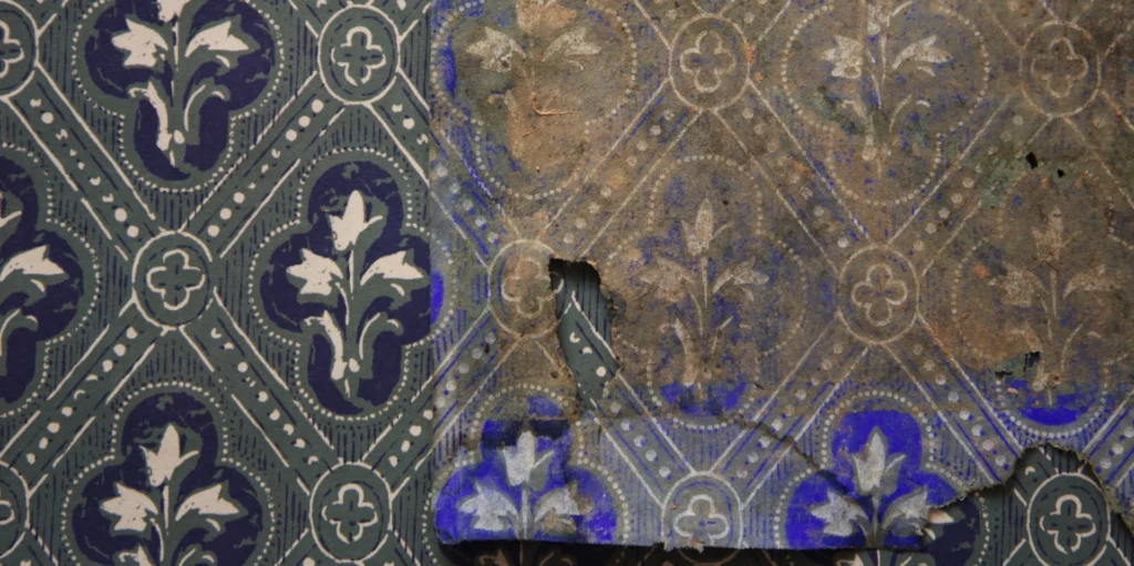
2. The Geometric Chrysanthemum: A Hybrid Design Where East and West Intersect
Art Deco’s defining principle — the geometric abstraction of nature — reaches its peak in the central floral motif. The chrysanthemum (gukwha, 菊花) is taken as the source form, yet the result resembles a finely cut gemstone or a snow crystal more than a living flower. The petals are resolved into geometric lines radiating outward; the stem, too, achieves a mathematical symmetry.
This schematization contains a remarkably shrewd double-coded strategy. To a Western eye it reads as a sophisticated rosette; to an Eastern eye it is received as the chrysanthemum, symbol of nobility and longevity. The central chrysanthemum is simplified to eight petals rather than the sixteen of the Japanese imperial crest — erasing any overtly political associations while preserving the emotional resonance of the sajunja (four noble plants) tradition familiar throughout the Northeast Asian world. The lines forming the grid, moreover, can be read simultaneously as the Western Greek Key and the Eastern thunder pattern (noemun, 雷紋) — allowing Eastern and Western symbolism to combine without conflict on the shared foundation of Art Deco.
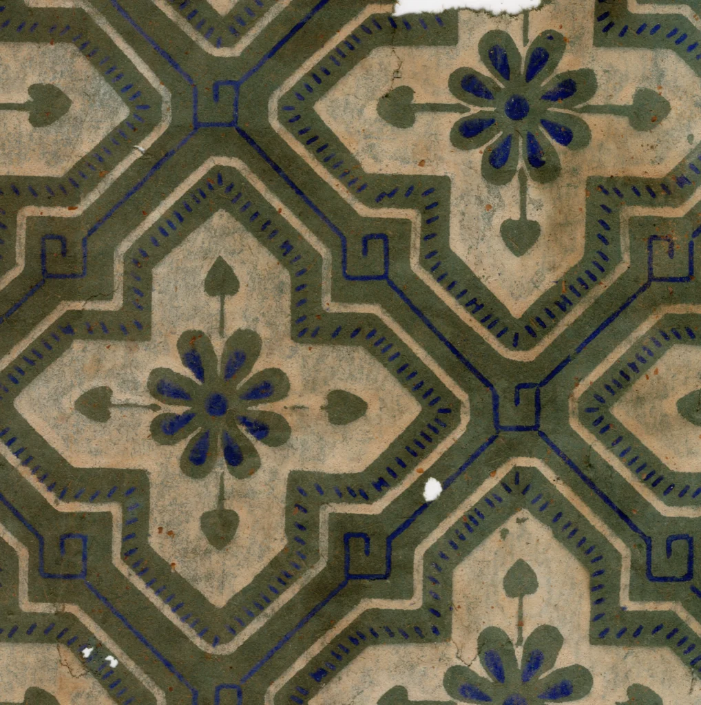
(Source: Collection of Gosate)
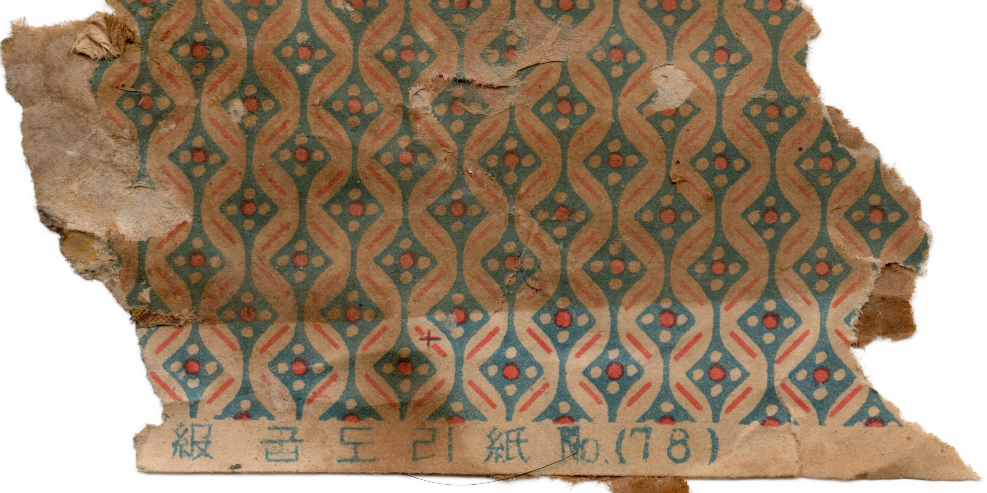
3. A Global Steady Seller: The Modern Distribution Network Connecting Changdeokgung and Colonial India
The reason this wallpaper was beloved across all social strata — from the royal corridors of Changdeokgung Palace’s Huijeongdang Hall to the inner rooms of ordinary homes — lies in the universality of its design. In the 1910s–30s, Art Deco was a global style connecting Paris, New York, and Gyeongseong (Seoul), and Japanese paper manufacturers captured this current to produce export flagship products targeting the whole of Asia.
The Japanese wallpaper sample books (gyeonboncheop) recently acquired by GOSATE from historic homes and warehouses in West Bengal, India, provide decisive evidence. Among the designs in these sample books, multiple samples match precisely — in both color and form — the wallpaper installed in Changdeokgung Palace. This demonstrates that a strategically designed product was created to target the vast Asian markets of British colonial India and Japanese colonial Joseon simultaneously: a design that stripped away political burden and maximized refined contemporary appeal.
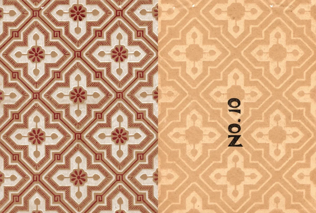
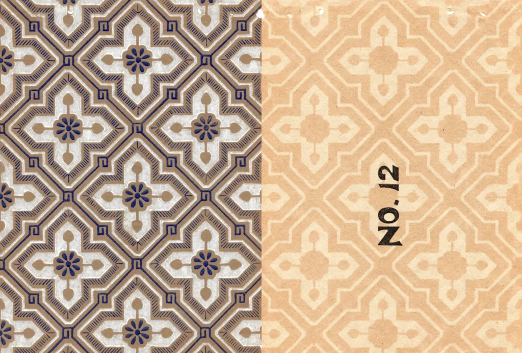
(Source : Gosate Collection)
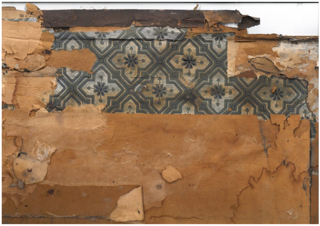
In sum, this wallpaper is a modern bestseller born from the meeting of an acute reading of the times and a double-coded design strategy. From the authoritative corridors of the royal palace to the study of the modern gentleman, and all the way to the distant land of India — this pattern is a visual record testifying to the enormous wave of modernity that swept across Asia in the early 20th century.
Copyright © 2026 Gosate Archive. All Rights Reserved.
All Rights Reserved.
- All text and scholarly analysis are the intellectual property of the author.
- All photographs marked “Gosate Collection” or “Photo by Gosate” are the copyright of GOSATE. Reproduction, copying, or distribution without prior consent is strictly prohibited.
- Historical images cited from external sources are subject to their respective copyright holders or public domain provisions.
Inquiries: contact@gosate.kr
More from this era