Embroidered in Silver: A 1943 Spot Floral Wallpaper
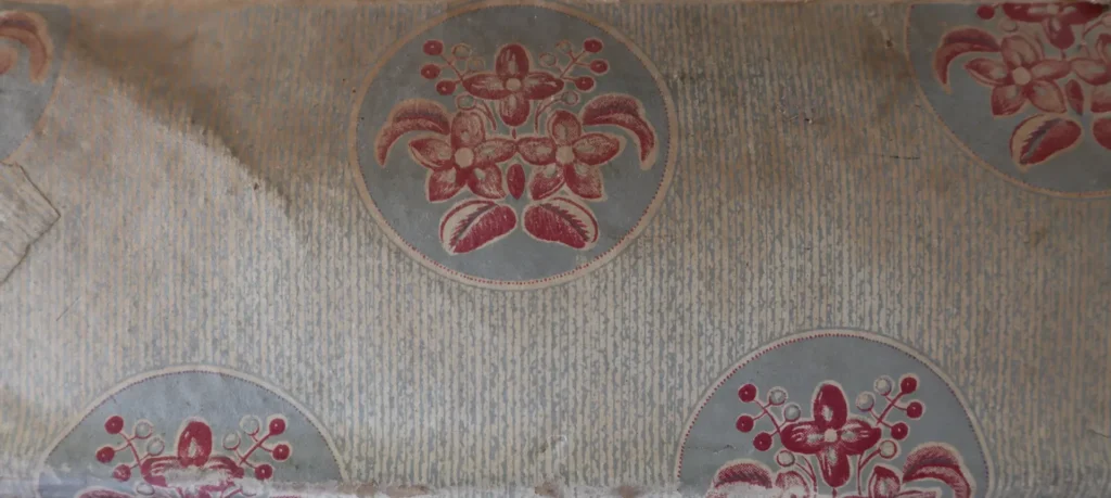
1. The Design's Origin: Fabric Applied to the Wall — the 'Spot Floral' From the late 19th into the early 20th century, a distinct current emerged in the French and British wallpaper markets —…

1. The Design’s Origin: Fabric Applied to the Wall — the ‘Spot Floral’
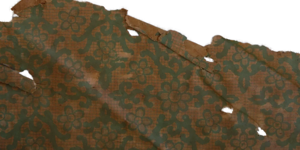
From the late 19th into the early 20th century, a distinct current emerged in the French and British wallpaper markets — separate from the grand damask and stripe traditions. This was the spot floral: small bouquets or flower vases placed at regular intervals like dots across the surface.
Wallpapers of this type were designed less as large-scale pictorial statements than as repeating textile patterns — closer in spirit to fabric than to painting. The bouquet within a rounded medallion, the gentle stripes and dots filling the spaces between, the fine stippling distributed across the entire ground — all of these were devices for reproducing on paper the warp and weft of cloth, the stitch of embroidery, the soft diffusion of silk. Printers of the period favored a technique of textile emulation: rendering tone and shadow not through heavy outlines but through countless dots and broken lines. The result was a medium that engaged not only the eye but the imagination of touch — a quality that made spot florals the preferred choice for bedrooms and intimate salons, and carried them from Europe into the East Asian market.
(Source : Gosate collection)
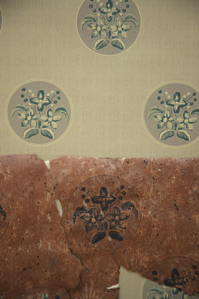
2. A Technical Peak: ‘Metallic Embroidery’ Realized in Silver Pigment and Pixel
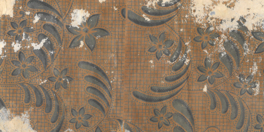
This wallpaper, found in a Joseon hanok and dated to 1943, is a remarkable case of the European spot floral tradition arriving in Korea and evolving one technical step further. The substrate is relatively thin pulp paper — but the refinement of the printing approaches the highest standard of its era.
The heart of this wallpaper is its silver pigment and stipple detail. Examining the production process: first, light and deep green establish the outline of the bouquet; the interior surfaces are then filled with finely divided dots — almost pixel-like in their regularity — to build a sense of volume. In the final stage, the ground stripes and medallion backgrounds are overprinted in silver pigment, adding a metallic shimmer. As a result, the boundaries between flowers and leaves do not end in a clean cut but dissolve into a scatter of points — an effect that, under lamplight, produces a softly luminous bloom. This is not simple printing. It is a sophisticated feat of print craft: the simultaneous realization on paper of woven textile structure and the glint of metallic embroidery.
(Source : Gosate collection)
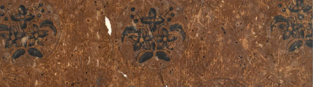
3. The Paradox of Its Time: Taste Flowering Amid Scarcity, 1943
The small bouquet medallion was the ideal instrument for projecting understated Western refinement in the narrow rooms of urban hanok or small commercial spaces. The decorative scale was reduced to suit the hanok, yet the silver-pigmented ground and precise pixel-like detail reveal that the consumers of this wallpaper were pursuing something beyond mere Western imitation — a genuine effort to fill their domestic spaces with a dense and considered aesthetic.
That silver pigment was used to dress hanok walls like embroidery, even amid the material shortages of wartime: this is evidence that Korean domestic culture of the 1940s was actively experimenting with and enjoying a luxurious Western-style interior in its own way, even under the most constrained of conditions.
Copyright © 2026 Gosate Archive.
All Rights Reserved.
- All text and scholarly analysis are the intellectual property of the author.
- All photographs marked “Gosate Collection” or “Photo by Gosate” are the copyright of GOSATE. Reproduction, copying, or distribution without prior consent is strictly prohibited.
- Historical images cited from external sources are subject to their respective copyright holders or public domain provisions.
Inquiries: contact@gosate.kr
More from this era