Between Encaustic and Dancheong: A Transitional Aesthetic in 1960s Korea
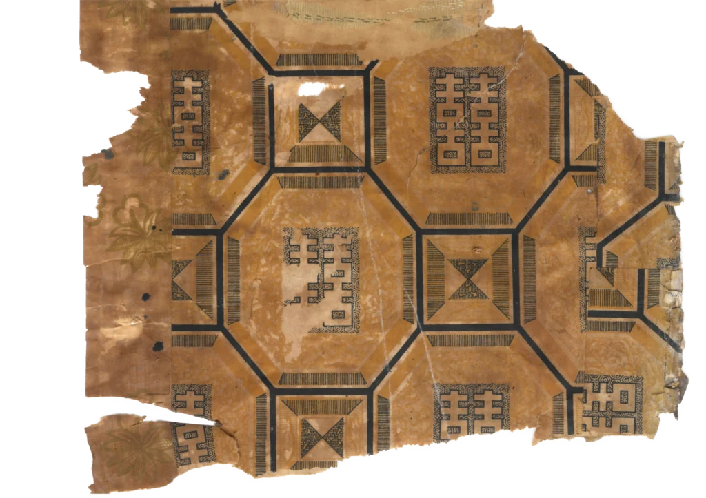
1. The Origin of the Design: From Floor to Ceiling, a Space Inverted At first encounter, this ceiling paper might call to mind the front panel of a traditional mother-of-pearl lacquer cabinet, or the…
1. The Origin of the Design: From Floor to Ceiling, a Space Inverted
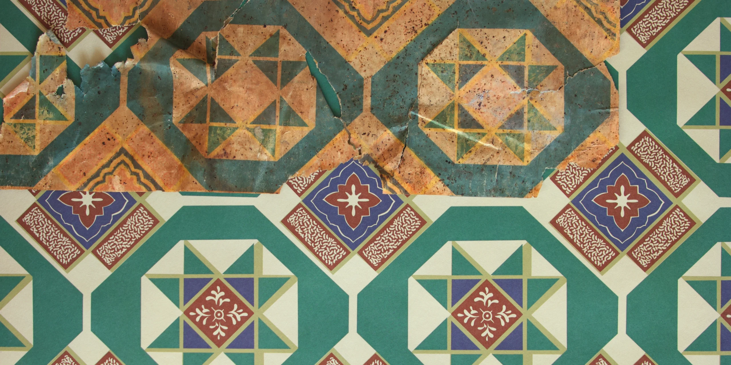
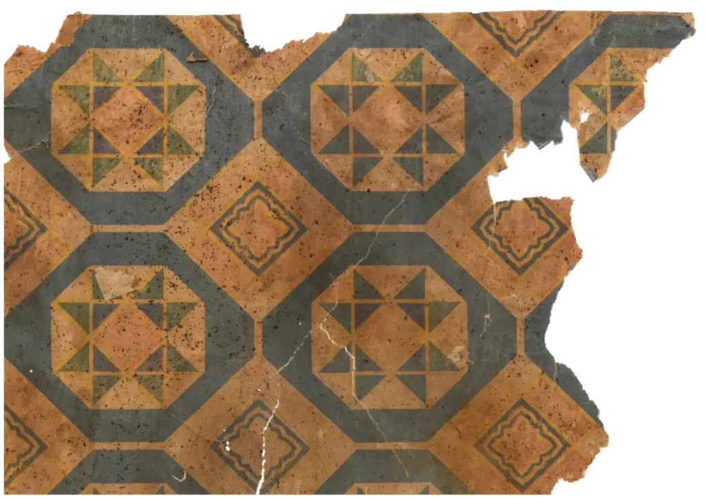
At first encounter, this ceiling paper might call to mind the front panel of a traditional mother-of-pearl lacquer cabinet, or the dancheong pigment ornament of a Buddhist temple. But strip away those associations and examine the structure coolly: this pattern is far closer to the geometric vocabulary of 19th–20th century Western encaustic tile and linoleum flooring.
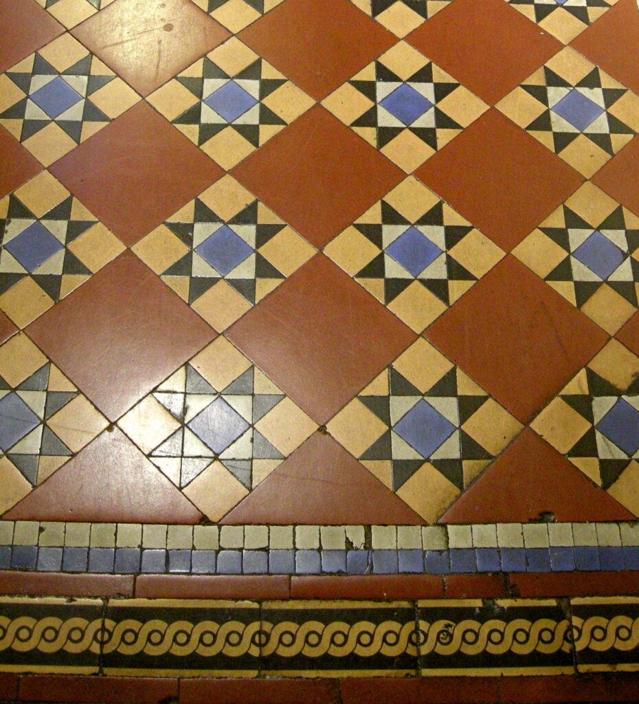
The basic unit is not a square but an octagon-and-diamond grid — octagons and lozenges interlocking with precision. A thin yellow band and black outline frame each octagon; stepping inward, crossing triangles build toward a star at the center. This is the standard repertoire of Victorian-era tile and early 20th-century linoleum flooring. The white vine-leaf motif stamped within the central diamond performs the role of the medallion — the decorative focal point of Western tile design.

What is striking is that this thoroughly floor-oriented grammar has been applied to the ceiling. The geometric tile and star patterns that lay underfoot in Western architecture have been lifted overhead in the Korean room. The result — lying on the floor and looking up — is a peculiar and distinctive spatial sensation: as though a Western carpet or tiled floor has been laid across the ceiling above. This is among the most refined examples of what might be called the “inverted floor grammar” found recurrently in early 1960s Korean ceiling papers.
2. A Translation in Color: Western Tile Geometry Dressed in Dancheong
Despite its Western geometric skeleton, this wallpaper carries a strong Korean presence — and the reason is color. The four colors deployed over the cream ground — brick red, yellow, green, and black — can be read as references to Western materials (red clay tile, stone inlay), but they simultaneously align precisely with the Korean five-directional color system (obangsaek: blue, red, yellow, white, black).

The color relationships are equally Korean in sensibility. The deep green filling the large octagon fields settles like the noerok (blue-green) ground of dancheong pigment work; over it, brick red and yellow alternate in a balance evoking the harmony of yin and yang. The small central floral ornament reads less as a Western acanthus than as the modest wildflower motif (chohwamun, 草花紋) of Joseon ceramics and folk painting. In other words: the skeleton of grid and star is borrowed from Western flooring, but the flesh and blood filling it have been repainted in the palette of Korean dancheong and minhwa. This is not simple copying — it is self-translation: Western form reinterpreted through Korean aesthetic sensibility.
3. A Testimony of Its Time: The Transitional Aesthetic of the 1960s
This wallpaper is significant evidence that in the early 1960s, Korean design was moving beyond the stage of copying Japanese pattern books and beginning to develop a voice of its own. After liberation and war, Korean designers worked to absorb the modern Western patterns reaching them while digesting those patterns through color sensibilities and emotional registers that felt their own. The bold appropriation of a Western tile pattern as a ceiling paper, and the eclectic effort to lay dancheong color over that structure, are traces of that intense process of negotiation.
Between Western tile and Korean dancheong. Between floor and ceiling. Suspended somewhere along those two axes, this wallpaper is among the clearest surviving records of the transitional aesthetic of 1960s Korean design — the effort to receive Western modernity on its own terms.
Copyright © 2026 Gosate Archive.
All Rights Reserved.
- All text and scholarly analysis are the intellectual property of the author.
- All photographs marked “Gosate Collection” or “Photo by Gosate” are the copyright of GOSATE. Reproduction, copying, or distribution without prior consent is strictly prohibited.
- Historical images cited from external sources are subject to their respective copyright holders or public domain provisions.
Inquiries: contact@gosate.kr
More from this era