A Pattern Seen on Screen<: The Mint Fractal Wallpaper of 1969 Korea
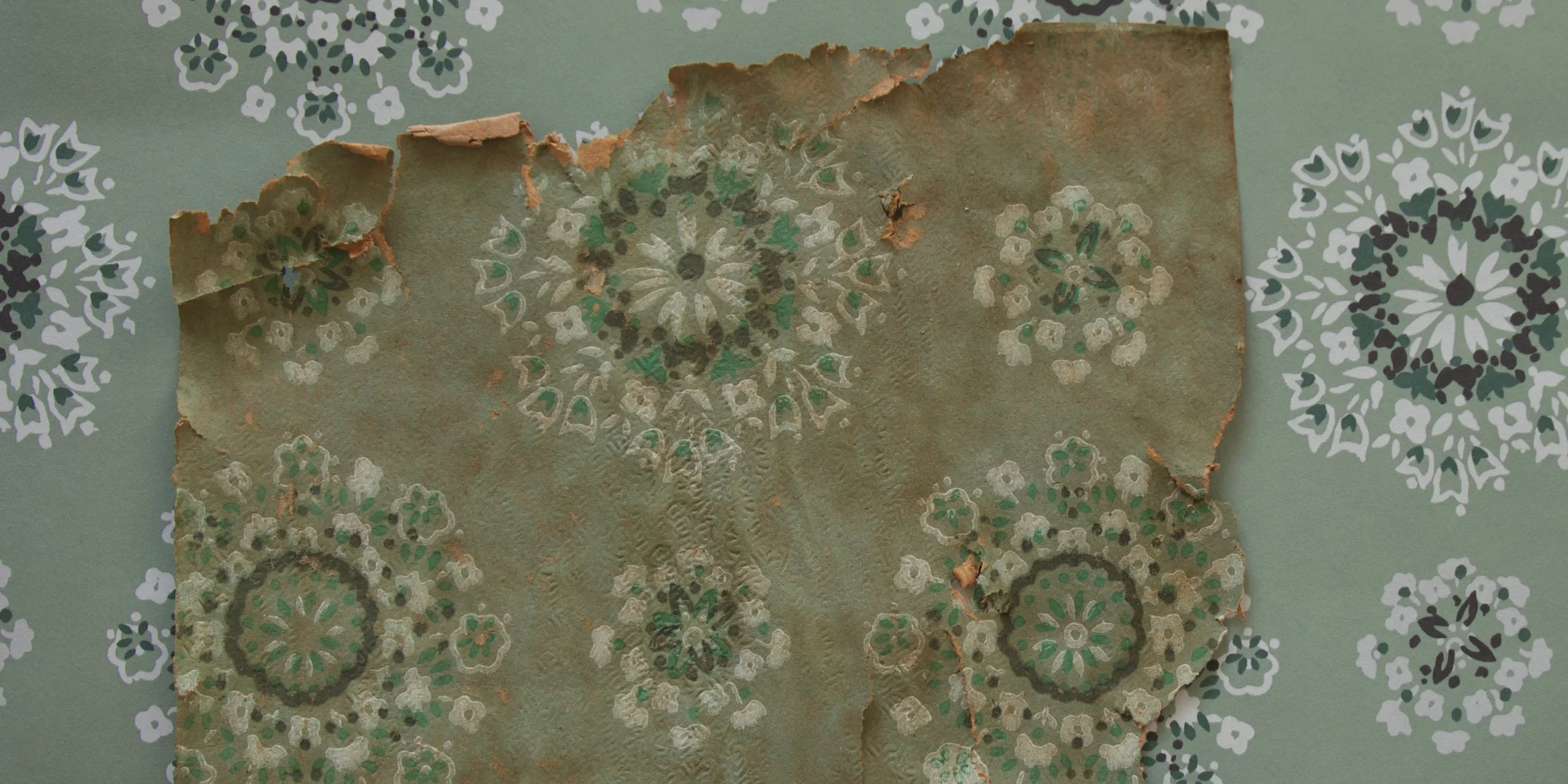
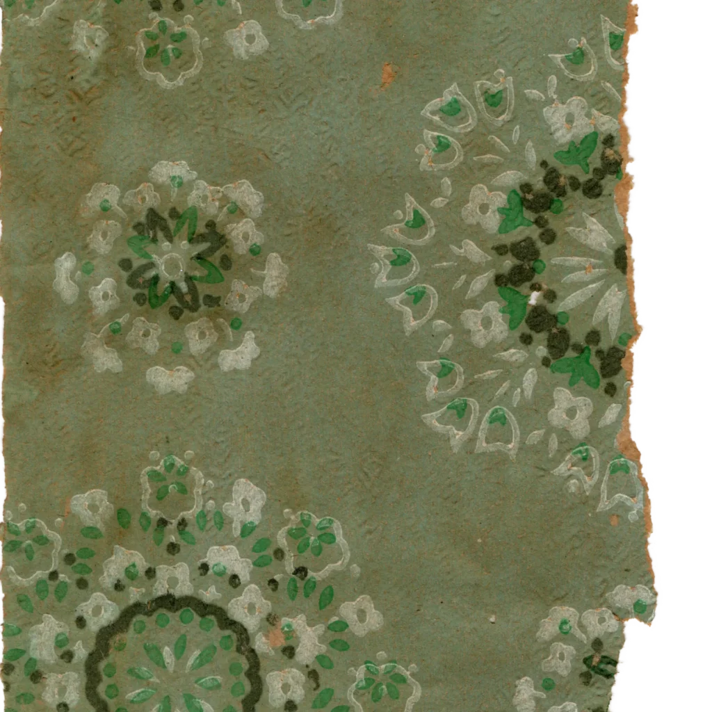
1. The Texture of a Design: A 'Fractal Snowflake' Read by Fingertip What first arrests the eye in this wallpaper is a cluster of flowers bursting outward in rounded form. Drop-like dots and petals…
1. The Texture of a Design: A ‘Fractal Snowflake’ Read by Fingertip
What first arrests the eye in this wallpaper is a cluster of flowers bursting outward in rounded form. Drop-like dots and petals surround a small, dark central core in multiple concentric layers to form a rosette, and smaller flower clusters wrap around the outside of that. This structure — smaller flowers layered concentrically within a larger one — evokes the natural geometry of a snowflake or a fractal.
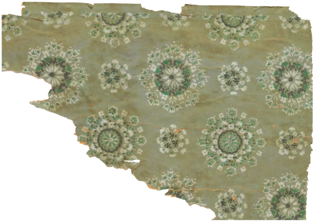
The arrangement is equally interesting. Rather than a perfect grid on graph paper, the distance and scale between units shifts subtly, producing a loose regularity — as though several lace doilies or hand-knitted blankets have been casually laid out side by side. The ink edges are not knife-sharp but softly absorbed into the paper fibers. Most importantly, this wallpaper has a tactile dimension: a fine embossing on the paper surface leaves a raised texture that can be felt before it is seen. This signals that wallpaper was evolving beyond flat printed sheet into a finishing material that gives texture to space.
2. Tracing the Lineage: A Northern European Design in Korean Color
The roots of this snowflake pattern connect to the Mid-Century Modern current that swept the world through the 1950s–60s. Rather than depicting flowers realistically, the design reduces them to dots, lines, and geometric forms — turning each unit into something closer to a sign than a representation. This approach aligns with the textile design tradition of Finland and Sweden in particular. Neither fully geometric nor concretely naturalistic, this abstract pattern with a handmade quality was a widely shared visual language in middle-class domestic fabric and wallpaper across Northern Europe, Britain, and America at the time.
Korean producers adopted this internationally fashionable pattern while calibrating it to the Korean domestic environment through color. Where Western Mid-Century patterns embraced high-chroma pop colors — orange, yellow — this wallpaper chose mint and a subdued sage green as its dominant tones. This was a strategic choice: to ensure the wallpaper integrated with rather than overpowered the wooden pillars and ochre-toned ondol floor mats of the hanok room. The Western design was taken as-is in form, but the palette was brought down a register and embossing texture added — producing a quiet modernity calibrated to Korean sensibility.
3. A Historical Record: The Wallpaper on Screen<남자와 기생> in 1969
This wallpaper is a telling indicator of where popular domestic taste in late 1960s Korea was heading. It shows that a period of thin, smooth paper wallpaper was giving way to embossed surfaces — wallpapers with raised texture beginning to reach the general market.
In a scene set in the main reception room of a yojeong (기생집) in the 1969 film A Man and a Gisaeng (남자와 기생), the same mint-ground fractal snowflake pattern as wallpaper ‘Geumok’ can be seen covering the entire wall surface. The scene is viewable via KMDb or the YouTube channel ‘Korean Classic Film.’
https://www.youtube.com/watch?v=vfwWE_fYmhQ&rco=1: A Pattern Seen on Screen<: The Mint Fractal Wallpaper of 1969 KoreaThis is confirmed by a 1969 Korean film, <A Man and a Gisaeng (남자와 기생)>. In a scene set in the main reception room of a Seoul urban gisaeng house, the same mint-ground fractal snowflake pattern covers the entire wall surface. That the film’s art department chose this wallpaper to dress a commercial interior space is evidence that this pattern occupied precisely the right zone in the popular imagination of the time: neither too old-fashioned nor too unfamiliar — comfortably within the range of current fashion.
Copyright © 2026 Gosate Archive.
All Rights Reserved.
- All text and scholarly analysis are the intellectual property of the author.
- All photographs marked “Gosate Collection” or “Photo by Gosate” are the copyright of GOSATE. Reproduction, copying, or distribution without prior consent is strictly prohibited.
- Historical images cited from external sources are subject to their respective copyright holders or public domain provisions.
Inquiries: contact@gosate.kr
More from this era