The Modernist Garden Comes to Korea: Graphic Florals of the Early 1960s
1. The Spirit of the Age: Plants Made Simple After the Second World War, interior decoration in Europe and North America moved in a new direction. The realistic roses, lilies, and grape clusters that…
1. The Spirit of the Age: Plants Made Simple
After the Second World War, interior decoration in Europe and North America moved in a new direction. The realistic roses, lilies, and grape clusters that had been the legacy of the Victorian era gradually receded, replaced by graphic patterns that distilled the outline and rhythm of plant life into clean, simplified form.
This shift moved in step with the rise of postwar Modernism and Scandinavian design. As Functionalist architecture pursued flatness and economy of means, wallpaper and textiles likewise shed exaggerated depth and tonal gradation in favor of flat graphic handling. Leaf veins were reduced from detailed rendering to spare lines; stems and berries were resolved into simple forms. The compositional approach changed as well — the grid of regularly arranged bouquets gave way to the all-over method, in which plants are scattered irregularly across the entire surface. Backgrounds received small dots or fine textures in place of plain flat color. From the late 1950s onward, these simplified plant patterns occupied kitchen curtains, upholstery, and wallpaper across the Western world — a shared current in postwar international interior design.
2. An Ambiguous Ground: Berries or Stipple?
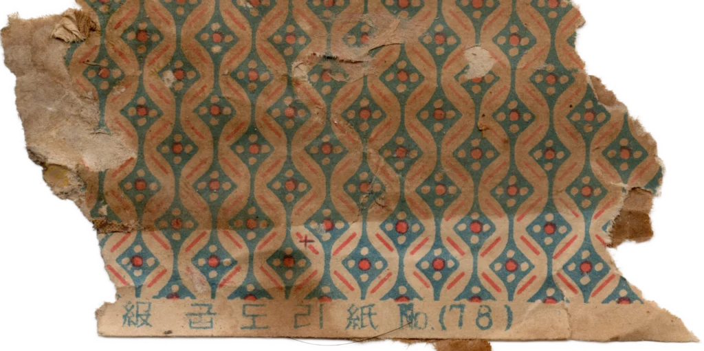
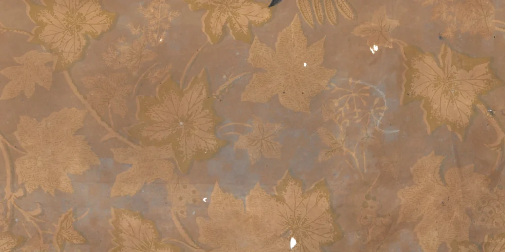
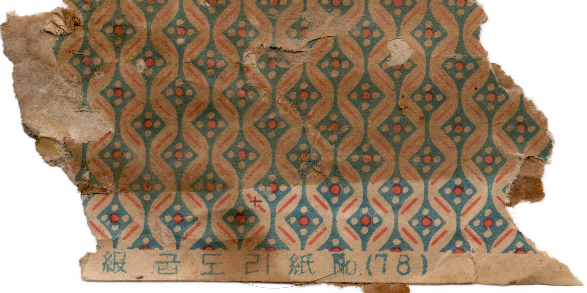
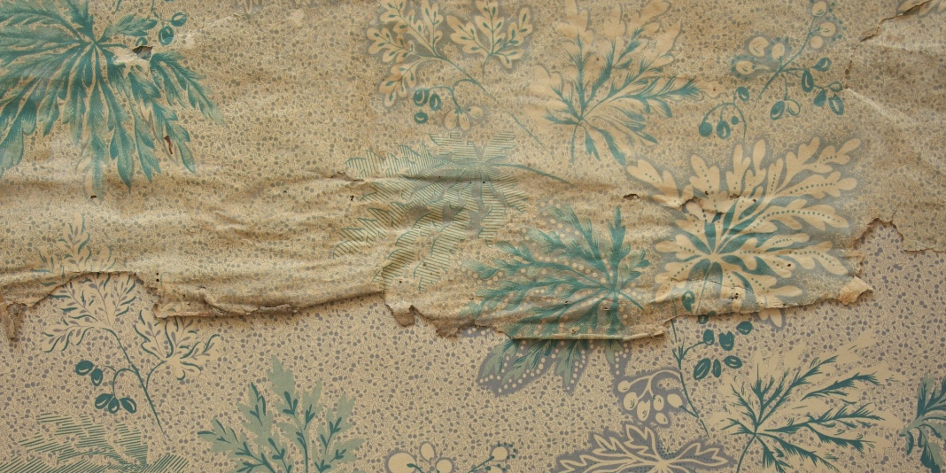
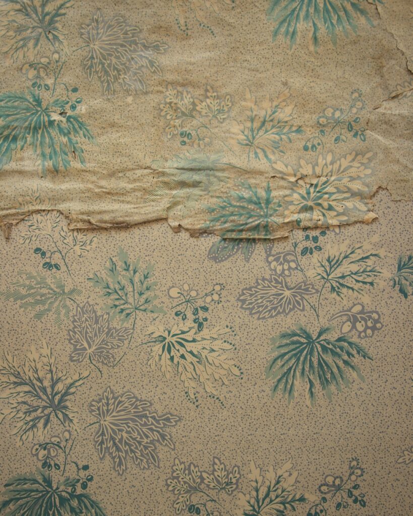
This wallpaper, discovered in early 1960s Korea, is the result of realizing the internationally fashionable graphic floral pattern through Korean printing technology.
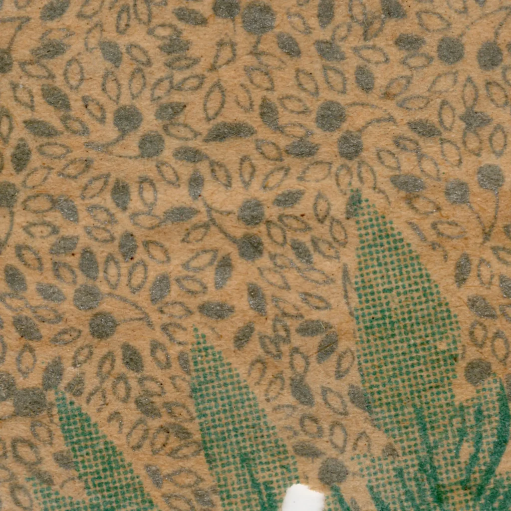
What first draws the eye is the density of the ground. The small motifs packed closely across the entire paper surface reveal themselves, on close inspection, as berry shapes — yet they are so small and tightly distributed that from a distance they read simply as a stipple texture. This duality is precisely what makes this wallpaper remarkable.
Step close and each element is clearly a small individual berry form; step back and they dissolve into a uniform texture resembling coarse burlap or fine-grained sand. This is not merely decorative fill — it creates a dual reading structurethat changes depending on the viewer’s distance.
This dense ground would have served several practical functions. It evokes the weave of a textile, lending a cloth-like quality to paper. It absorbs minor printing errors, ink irregularities, and the small stains that accumulate over time. And it provides a uniform tone across the wall surface, creating a calm, settled atmosphere — richer than a flat single color, yet without distraction.
(Source: Collection of Gosate)
The leaf and berry clusters laid over this ground follow international convention. The plant species is simplified beyond specific identification; the leaf silhouettes and spare vein treatment are characteristic techniques of 1950s commercial illustration. The all-over composition, with leaves overlapping as though drifting through the air, was a widely used approach in Western textiles and wallpapers of the period.
3. A Proof of Technique: The Challenge of Precision Printing
What distinguishes this wallpaper from mere imitation is the precision of its printing.
Precision of its printing technology
Reproducing hundreds of tiny berry motifs in accurate, consistent repetition is technically demanding work. In copper-plate offset printing, achieving uniformity at this level of fineness and density requires extreme precision in both plate preparation and color registration — the slightest misalignment and the entire texture falls apart.
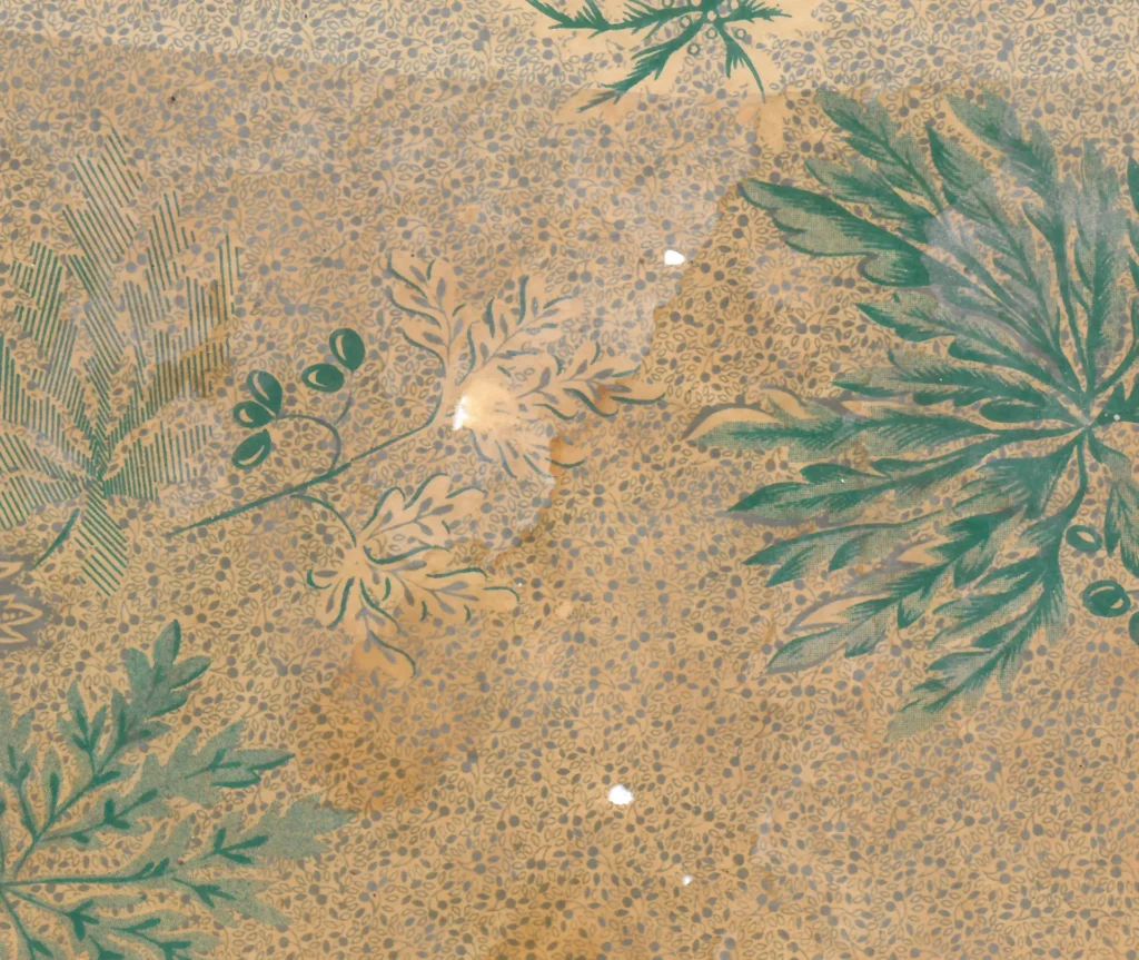
Up close, the colored dots filling the faces of leaves and berries are as finely divided as pixels in an enlarged digital image. This is the stippling technique — the traditional method of rendering midtones in print and giving color depth and body. It is evidence that early 1960s Korean wallpaper factories, while adopting modern Western graphic designs, were deploying the full capacity of the precise printing technology they possessed in order to realize them.
Calm color
The color palette is equally considered. Rather than the bold primaries of Western graphic design, the tones are resolved into calm teal and green — a palette fashionable internationally in the 1950s–60s, and particularly associated with Northern European and American Mid-Century design. Outlines are handled softly rather than in high contrast, giving the pattern a quietly atmospheric overall mood.
4. A Testimony of Its Time: International Trend, Technical Achievement
This wallpaper is evidence of how early 1960s Korea absorbed and realized the simplified graphic floral pattern that was circulating internationally in the postwar world.
Rather than simply copying design trends arriving through the West and Japan, Korean wallpaper factories reinterpreted them through the precision printing technology they had developed. The bold choice to fill the entire ground with minute berry motifs produced a unique effect of visual duality — every individual form alive up close, the whole surface reading as a single unified texture from a distance. That delicate balance is the true achievement of this wallpaper.
Copyright © 2026 Gosate Archive. All Rights Reserved.
All Rights Reserved.
- All text and scholarly analysis are the intellectual property of the author.
- All photographs marked “Gosate Collection” or “Photo by Gosate” are the copyright of GOSATE. Reproduction, copying, or distribution without prior consent is strictly prohibited.
- Historical images cited from external sources are subject to their respective copyright holders or public domain provisions.
Inquiries: contact@gosate.kr
More from this era