Gyodongdo, 1943: Imperial Ink and the Reality Behind the Wallpaper
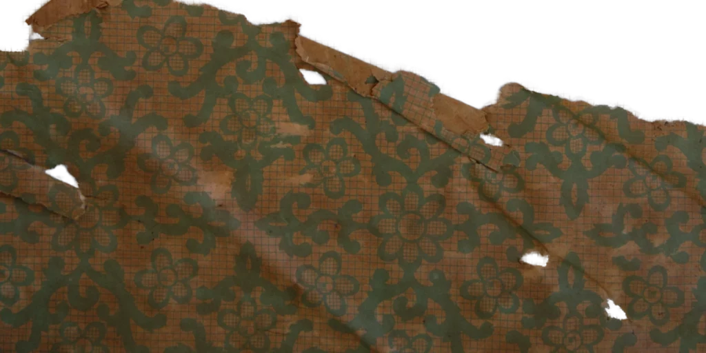
Original scan of wallpaper 'Jaeho'(Source: Collection of Gosate) 1. An Island on the Border, and the Memory of the Yen Bloc Gyodongdo draws a fair number of visitors on weekends, but crossing the Gyodong…

(Source: Collection of Gosate)
1. An Island on the Border, and the Memory of the Yen Bloc
Gyodongdo draws a fair number of visitors on weekends, but crossing the Gyodong Bridge from Ganghwa Island is still accompanied by a peculiar tension. The first thing that greets you is a red flag and a Marine Corps checkpoint. In the brief silence of handing over your visitor pass, a forgotten reality reasserts itself: this is a contact zone where North and South Korea still point rifles at each other.

(Photo by Gosate 2023)
But turn the clock back to 1943 and the scene was entirely different from today’s severity.
Gyodongdo had long been a strategic junction where the waterways of Gyeonggi, Hwanghae, and Chungcheong provinces converged. In the early 1940s, under the banner of the Greater East Asia Co-Prosperity Sphere, the island functioned as a vital artery of the vast economic community — the so-called Yen Bloc — linking Japan, Joseon, Manchuria, and China. The abundant produce of the Hwanghae Yeonbaek Plain and the latest goods from China passed through Namsanpo Port at Gyodong Eupseong, while the enormous capital unleashed by wartime inflation flowed into the island.
The wallpaper introduced today was discovered in a hanok near Gyodong Eupseong, in precisely that era — a time still buzzing with wartime economic activity.

(Photo by Gosate 2023)
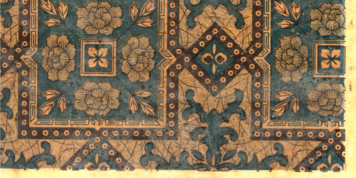
2. The Solidity of the Floor, the Splendor of the Wall: The Aesthetics of a Hybrid Tile
1) Victorian Nostalgia: Neo-Gothic and the Encaustic Tile
To understand the design of this wallpaper, we must first turn briefly to mid-19th century Britain. In an era when factory chimneys and iron-frame structures were overtaking the cities, British society paradoxically began to long for the spiritual beauty of medieval cathedrals and monasteries. This was the Neo-Gothic movement. Architects of the time wanted not only building exteriors but floors and textiles to follow the geometric order of the Middle Ages — and from that desire was born the encaustic tile.

(Source : A.W.N. Pugin, Contrasts (London: Charles Dolman, 1841), plate ‘Catholic Town in 1440; the same town in 1840’)
The encaustic tile was not simply a surface-painted material but a fired floor covering in which differently colored clays were directly inlaid into the body. These durable tiles — whose color could not be worn away by thousands of footsteps — were used primarily in church, school, and government building corridors, symbolizing the authority and permanence of the institution.
The interlocking cross pattern was the most representative grammar of the encaustic tile. The mesh of crosses locking endlessly in all four directions simultaneously delivered visual rhythm without disorder and structural stability.

(Source: Wikimedia Commons)

(Source: Collection of Gosate)
2) The Floor Grammar Lifted to the Wall: An Imagined Hybrid
This wallpaper, discovered on Gyodongdo in 1943, remarkably transposes a 19th-century British floor pattern onto a 20th-century Joseon wallpaper. The geometric structure filling the wallpaper is unmistakably the interlocking cross of the encaustic tile. A heavy pattern originally designed to bear the weight of human footsteps has been boldly translated into a finishing material for a vertical wall.
What is fascinating is that while the structure follows the floor (encaustic), the detail imitates the splendor of wall tiles. The fine dots printed along the borders of the cross are not simple halftone printing dots. They reproduce on a flat surface the beading — the relief technique used in Majolica tiles, where raised ridges prevent liquid glazes from bleeding into each other during firing. This wallpaper is, in essence, a tile in which the solid skeleton of the encaustic and the decorative flesh of the Majolica have been fused on paper.

(Photo by Gosate 2025)

(Source: Collection of Gosate)
3. Craquelure and the Thunder Pattern: A Code Running Across East and West
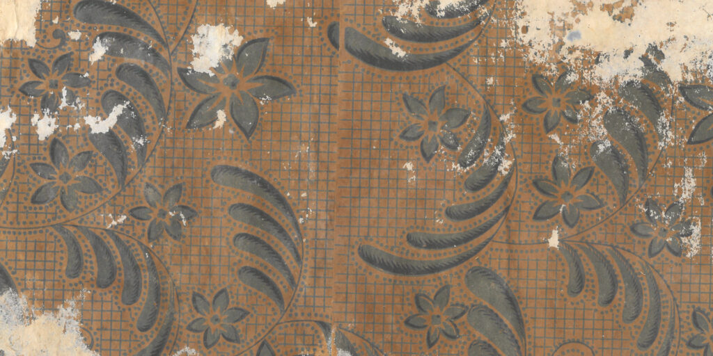
The fine textures and decorative motifs filling the pattern are equally significant. The ground between the crosses and grid is printed with a texture evoking craquelure — the network of fine cracks on the surface of aged ceramics — or marble veining, or the minute grain of leather. This faithfully follows the 19th-century Western wallpaper technique of faux-finish: the attempt to simulate, on flat paper, the surface quality of costly aged materials.

(Source: Collection of Gosate)
More interesting still is the geometric band decorating the border. In Western art history this is called the Greek Key or Meander — a symbol of ancient Greek eternity. Yet in the East, the identical form has been called the thunder pattern(noemun, 雷紋) or wan-ja pattern (wanjamun, 卍字紋) — symbolizing auspiciousness and infinite blessing for millennia. The use of this angular, winding linear pattern is no coincidence. In introducing a Western tile pattern, the designer cleverly deployed a dual code — one that reads as tradition and authority in both Eastern and Western contexts — to ensure the design would not feel foreign to East Asian consumers.
But the decisive evidence that clinches this cultural fusion lies elsewhere: in the peony (moran, 牡丹) that fills the geometric border. The peony, universally symbolizing wealth and prosperity across Korea, China, and Japan, was the most beloved auspicious motif among homeowners of the time. What demands attention is the mode of representation. The designer took the most Eastern of subjects — the peony — and translated it thoroughly through the grammar of Western design: symmetry, repetition, and schematization. Eastern flavor poured into a Western vessel. This stylized peony, more clearly than even the Greek Key, proves that this wallpaper was no mere Western imitation — it is a hybrid, reborn as the modern aesthetic sensibility of Northeast Asia.

(Source: Collection of Gosate)
3. The Shanghai Brushstroke, or the Continental Color Japan Desired
Where did this exotic object come from? It is tempting to assume, given its colonial-era origins, that it was a domestic Japanese product — but examine the pattern’s rendering and color palette closely and a strong scent of the continent — Shanghai, Manchuria — becomes apparent.
The acanthus leaf ornament at the tips of the crosses lacks the sharpness of the Western original. Instead it is rounded, blunt, and somewhat oily in feel — sharing an aesthetic sensibility with the yuefenpai (月份牌) advertising posters of 1930s–40s Shanghai: the so-called Shanghai Modern style, which rounded and domesticated Western Art Deco through the brushstroke of Chinese painting. The smooth yet tough paper stock and the deep teal (cheongrok) ink also exhibit characteristics typical of lithographic print materials fashionable in the concession districts of Shanghai and Dalian at the time.


The crisp Western acanthus design has been reinterpreted through the Chinese painter’s brushstroke into rounded, blunt Eastern motifs resembling cloud patterns (unmun) or arabesque scrolls (dangchomun).
(Source: Pinterest)

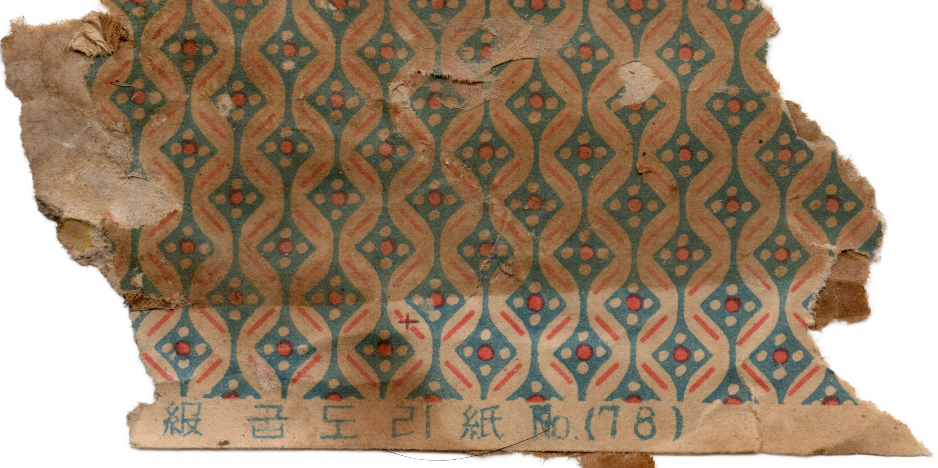
The Western acanthus leaf appears to have been simplified into a geometric cross form — sharing visual context with the carpet motifs in the yuefenpai examined above, and interpreted as an example of the process by which Western ornament was domesticated into an East Asian design vocabulary. (Source: Collection of Gosate)
This does not necessarily mean the wallpaper was produced in China. The Shanghai style was itself fashionable within Japan as a symbol of modernity.
The possibility therefore cannot be excluded that a Japanese paper manufacturer planned and produced this as a continental-style (daeryukpung, 大陸風) design for the Shanghai, Manchurian, and Joseon markets. Either way, what is certain is that this wallpaper is the projected embodiment of the desire for a Western modernity that ran through all three East Asian nations of the time.
4. The Reality Behind the Wallpaper: “The Passion of the Continent” and the Morning Bow
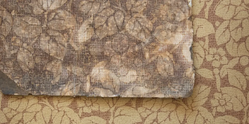
Yet the fantasy of this beautiful wallpaper turns cold the instant one looks beneath it. When the backing papers supporting the wallpaper were peeled away, the pages of a Maeil Sinbo (每日申報) newspaper from around 1943 were revealed.

(Source: Collection of Gosate)
The articles within are jarringly at odds with the decorative splendor of the wallpaper above — they testify to the desperate urgency of the war’s final stages. At the center of the page, beneath the incendiary headline “Carrying the Passion of the Continent”, a photograph shows young men of the volunteer corps lined up to depart for Manchurian development. This was the period when Japan was driving Korean youth into mortal danger under the euphemism of “pioneering.” And in the lower right corner, an article announces a change in broadcast time for the morning bow toward the Imperial Palace (gunseong yobae, 宮城遙拜) — a vivid reminder of the suffocating daily existence of colonial subjects, whose very hour of bowing east toward the Japanese emperor was state-controlled.
5. Conclusion: Anxiety of an Era, Papered Over with Fantasy
In the end, this wallpaper is more than a decorative object — it is a historical document that condenses the strange contradictions of the Yen Bloc era of the early 1940s. At the front, the terror of conscription was real — young men were being driven into the line of fire. Yet paradoxically, within the vast economic bloc mobilized to wage that very war, military capital and materials were circulating more actively than ever. Gyodongdo, a trade hub on the Yellow Sea, stood at the very front line of that contradiction.
Even as the pressure of conscription and forced confiscation tightened, someone here was able to paper their walls with a fashionable, luxurious import from the continent. The smooth, sumptuous pattern of capital laid so casually over the backing paper inscribed with “decisive battle” (gyeolcheon, 決戰) — this layering is a vivid record of the landscape of the late colonial period: war, exploitation, and the desire of capital, tangled together in all their complexity.
Copyright © 2026 Gosate Archive.
All Rights Reserved.
- All text and scholarly analysis are the intellectual property of the author.
- All photographs marked “Gosate Collection” or “Photo by Gosate” are the copyright of GOSATE. Reproduction, copying, or distribution without prior consent is strictly prohibited.
- Historical images cited from external sources are subject to their respective copyright holders or public domain provisions.
Inquiries: contact@gosate.kr
More from this era