
1. Anatomy of a Design: A Three-Step Tile, an Illusion of Volume
1. Anatomy of a Design: A Three-Step Tile, an Illusion of Volume The basic unit of this pattern is not a flower but an octagonal tile. Octagons interlocking like a chessboard, with square blocks…
1. Anatomy of a Design: A Three-Step Tile, an Illusion of Volume
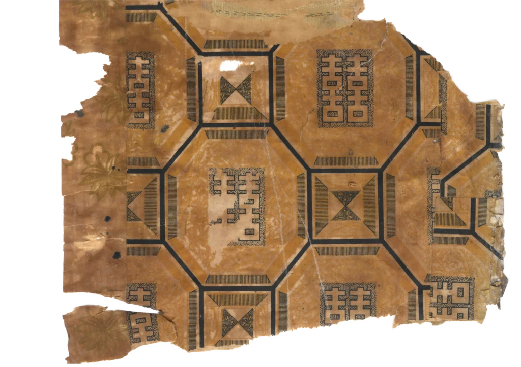
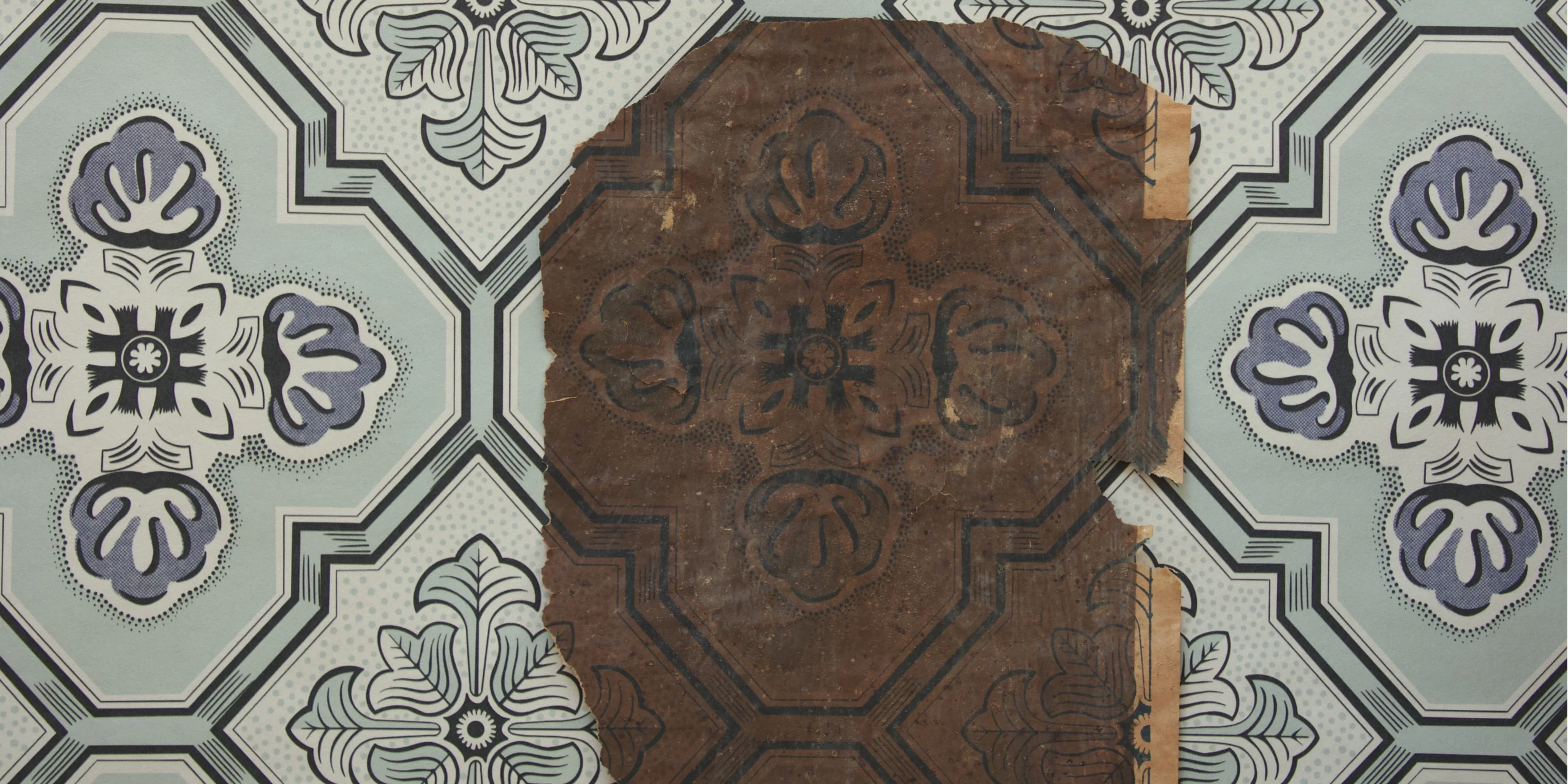
The basic unit of this pattern is not a flower but an octagonal tile. Octagons interlocking like a chessboard, with square blocks filling the gaps between them — the structure evokes linoleum flooring or ceramic tile viewed from directly below, looking up at a ceiling.
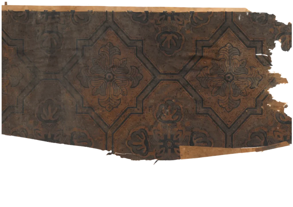
(Source: Collection of Gosate)
The most striking detail is the step frame. The octagon’s border is not drawn as a single line but rendered as a three-stage staircase stepping inward — a succession of receding planes. By crossing lines of varying weight to create tonal contrast, the design produces the illusion of actual depth on flat paper: the impression of stone panel or enamel tile set into the surface. The fine stippling that fills the interior of each frame is an equally precise trompe l’oeil technique, making the smooth paper surface read as rough stone or glazed enamel.
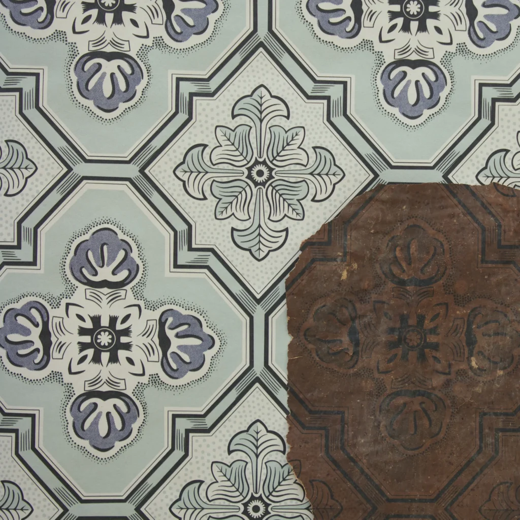
중심에 놓인 네 잎 장식은 식물이라기보다 석조 장식에 가깝습니다. The four-leaf ornament at the center reads less as plant life than as carved stonework— a geometric simplification of the Gothic and Renaissance quatrefoil and acanthus leaf. The parallel-line hatching inside the leaves and the raised terminal decorations at the tips are graphic translations of stone’s hardness rather than nature’s softness. Though the original color can no longer be known with certainty, the volumetric rendering achieved through tonal contrast alone firmly establishes this design’s identity: Western tile grammar, transposed onto paper.
2. Absorption and Transformation: The 1960s, a ‘Neutral Ground’ Beyond the Floral
In the Korean domestic culture of the post-Enlightenment era, which had long admired Western architectural materials, tile-shaped wallpaper was embraced early as a favored ceiling paper. This design is the result of that enduring tradition evolving through the sensibility and technology of the 1960s.
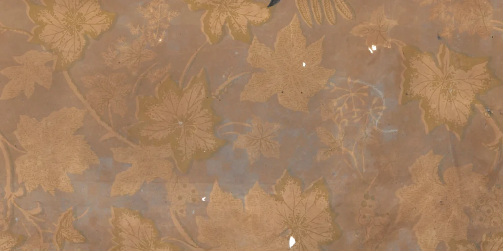
In terms of printing technique, this wallpaper directly inherits the high standard of prewar Japanese-manufactured imports. The fine outlines of the leaves, the delicate interior strokes, the gradated stippling — all of this demonstrates that Korean printing factories had fully reactivated the precision machinery and accumulated expertise of the pre-war era. Western tile grammar adopted; finished with precision through local production technology.
What is most interesting, however, is the neutral atmosphere this pattern carries. By simplifying the petals to near-geometric forms and adopting the rigid grid structure characteristic of tile, this wallpaper transcended the conventional limits of the “bedroom floral. ” This dry, solid pattern — imposing no particular emotional register — acquired a modern face capable of dissolving without friction into functional spaces: the living room, the shop front, the corridor, the kitchen. This connects directly to the desire of 1960s Korean society to furnish domestic space in ways that felt functional and contemporary.
Copyright © 2026 Gosate Archive. All Rights Reserved.
All Rights Reserved.
- All text and scholarly analysis are the intellectual property of the author.
- All photographs marked “Gosate Collection” or “Photo by Gosate” are the copyright of GOSATE. Reproduction, copying, or distribution without prior consent is strictly prohibited.
- Historical images cited from external sources are subject to their respective copyright holders or public domain provisions.
Inquiries: contact@gosate.kr
More from this era