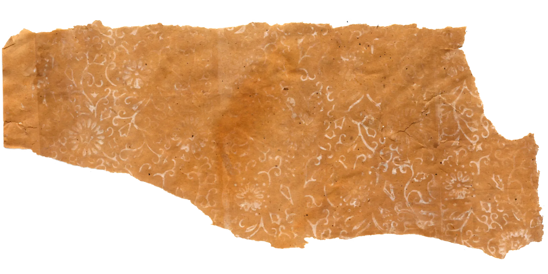
1. Anatomy of a Design: Dancing Vines and an Orange Rhythm
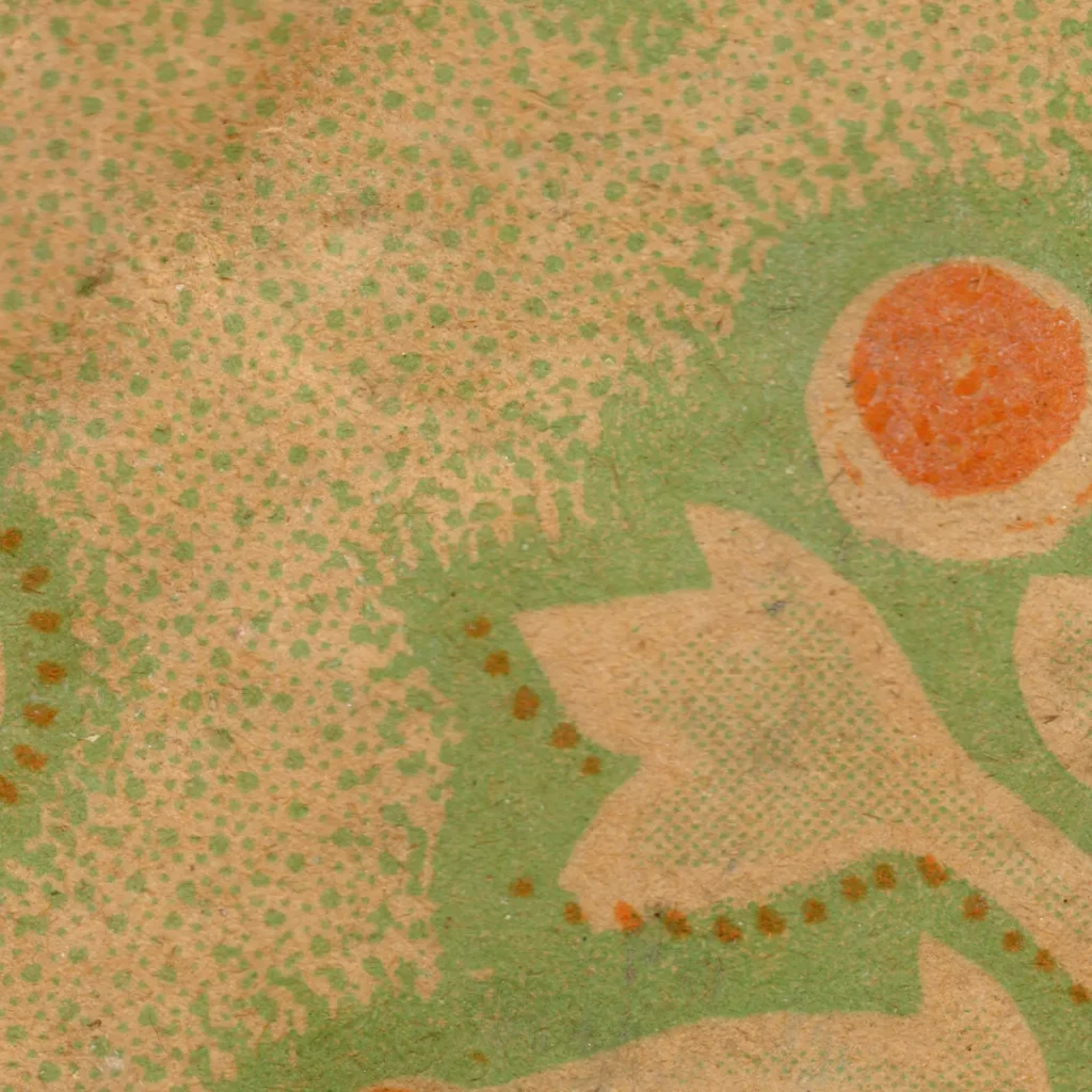
The first sensation this wallpaper delivers is the unbroken flow of vines and leaves filling every inch of the surface. The scroll motif — C- and S-curves crossing and interweaving — follows a decorative grammar stretching back to the Baroque and Rococo periods. Look closely and nearly-symmetrical repeat units pack the picture plane in a continuous all-over composition: the same structural approach found in 19th-century William Morris wallpapers and Victorian textiles.
The technique is remarkably refined. The leaf outlines are simplified, yet the yellow-green shading along the edges and fine stippling create a distinctive depth. Up close these dots resolve into complex detail; from a distance they spread softly like a diffused atmospheric ground. Over this, bright orange flowers — reduced to rounded petals and circular centers — bloom across the surface, placing a buoyant rhythmic accent over the intricate vine structure beneath.
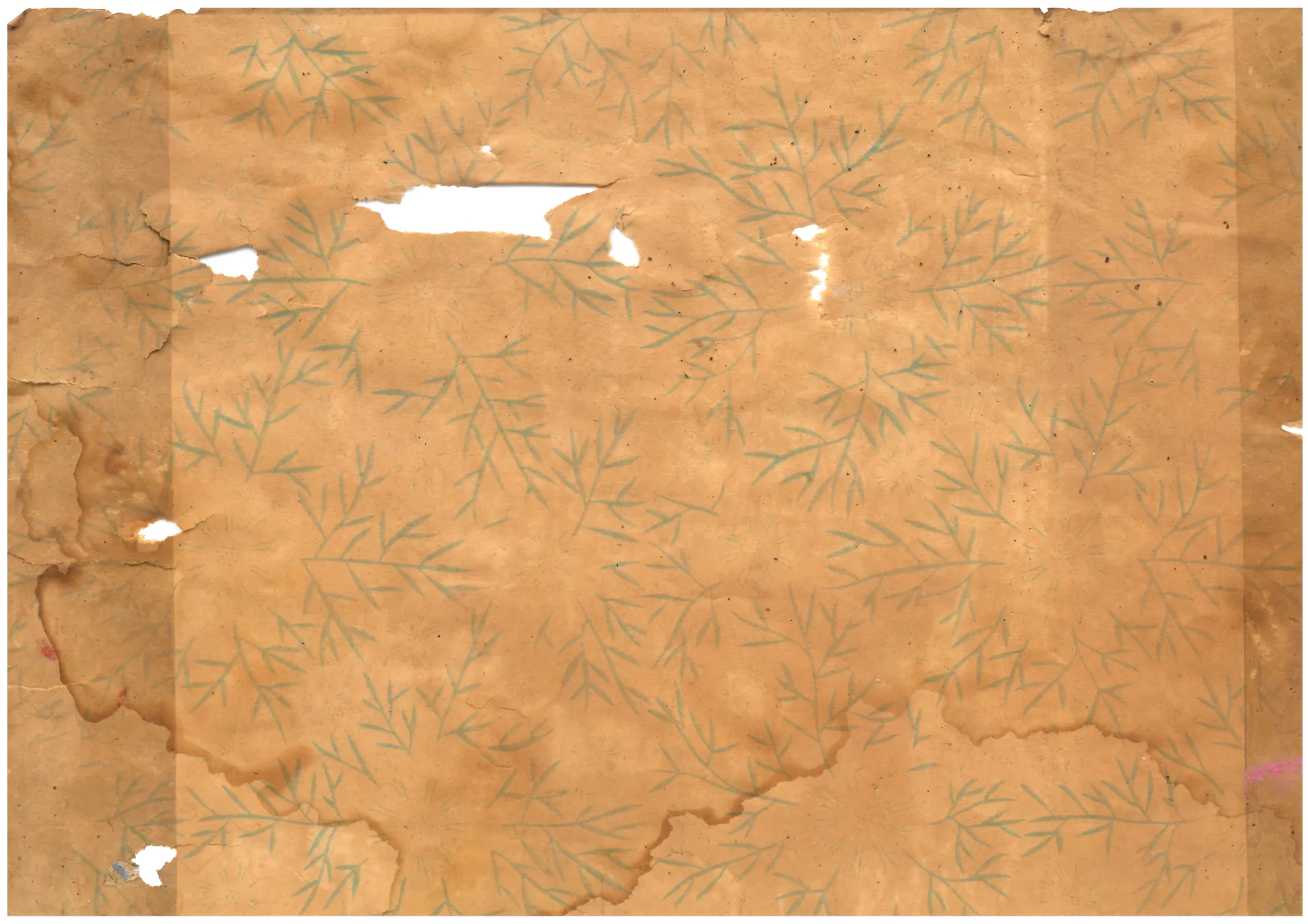
(Source: Collection of Gosate)
(Source: Collection of Gosate)
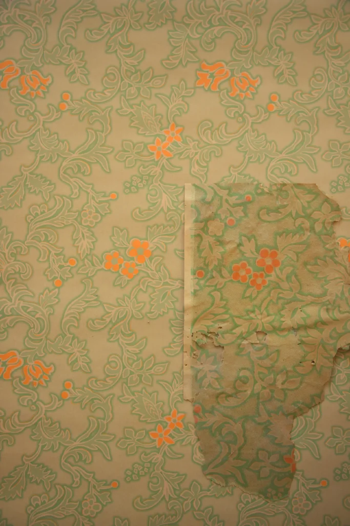
2. Same Pattern, Lighter Color: A New Sensibility for a New Era
What is most interesting about this wallpaper is the way the all-over scroll structure — a formula already well established — has been re-expressed in a sensibility appropriate to its time. 19th-century European decorative wallpapers also used the all-over vine composition, but rendered it predominantly in heavy, authoritative tones: deep reds, golds, and browns. They aspired to imitate the texture of actual fabric through flock printing or embossing.
The mass-market wallpaper of the 1950s–60s takes an entirely different approach. Heavy texture gives way to bright, clean color; faithful material imitation gives way to flat, graphic handling. This shift owes something to Modernist aesthetics, but more directly it reflects the democratization of printing technology and the spread of postwar middle-class domestic culture. The era had arrived when anyone could own a wallpaper that felt bright and fresh — no expensive import required.
The yellow-green vine and clear orange combination of this wallpaper carries precisely that spirit of the age: the traditional scroll grammar faithfully followed, but the color palette boldly lightened and lifted.
3. A Korean Translation: A Palette That Brightened the Narrow Room
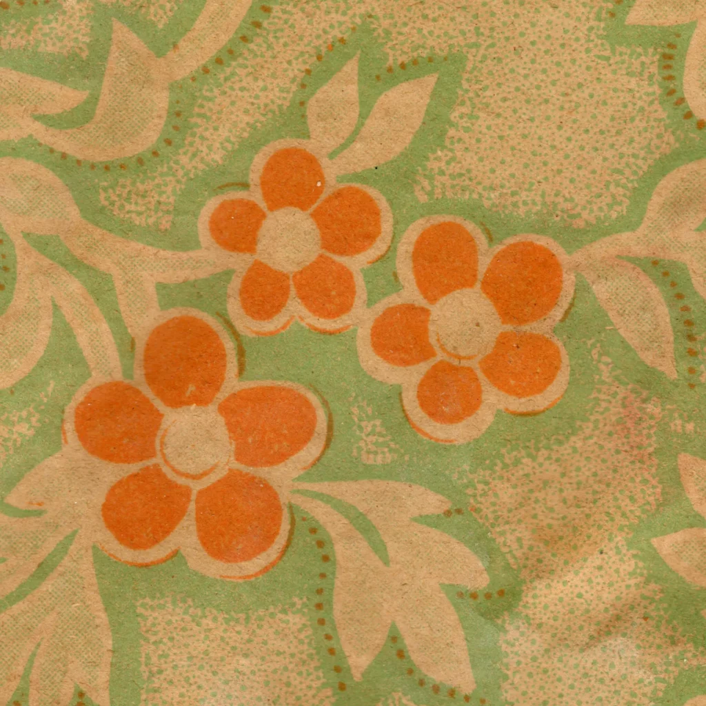
This wallpaper, produced in early 1960s Korea, represents an accomplished translation of the European graphic floral into Korean technique and sensibility. Most striking is the color strategy characteristic of Korean wallpaper of the era. The yellow-green and clear orange combination appears frequently in contemporary packaging design and wallpaper alike — a practical choice aimed at making the interiors of narrow hanok rooms and urban dwellings read as wide and bright as possible.
At the same time, this wallpaper demonstrates that Korean printing technology had reached a considerable level of refinement. The fine background dots, the thin lines tracing each leaf, the small circles at the flower centers — all printed crisply, without smearing. This level of detail is impossible without precise color separation and registration technique.
In the end, this wallpaper is a collaborative product of its era: the botanical scroll grammar of 19th-century Europe as its skeleton; the free graphic sensibility of postwar Northern European design as its flesh; the delicate printing craft and vivid palette of early 1960s Korea as its finishing coat.
Copyright © 2026 Gosate Archive.
All Rights Reserved.
- All text and scholarly analysis are the intellectual property of the author.
- All photographs marked “Gosate Collection” or “Photo by Gosate” are the copyright of GOSATE. Reproduction, copying, or distribution without prior consent is strictly prohibited.
- Historical images cited from external sources are subject to their respective copyright holders or public domain provisions.
Inquiries: contact@gosate.kr