The Rose That Learned to Bleed: An Aesthetic Born from Scarcity
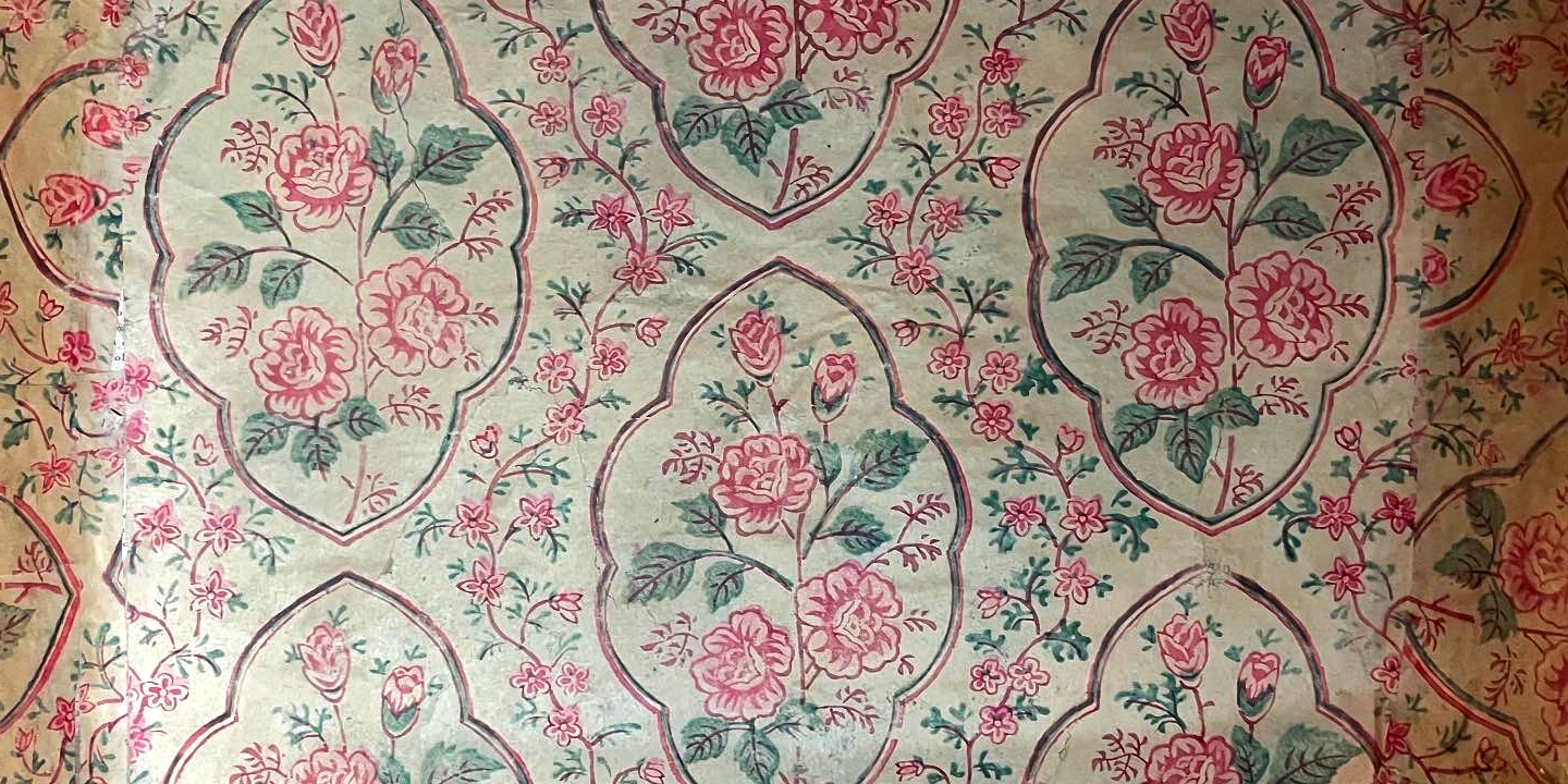
1. A Design Lineage: The Garden from India, the Legacy of the Indienne The underlying structure of this wallpaper is a classic 19th-century European floral. Ogee- and almond-shaped medallions — pointed at the top,…
1. A Design Lineage: The Garden from India, the Legacy of the Indienne
The underlying structure of this wallpaper is a classic 19th-century European floral. Ogee- and almond-shaped medallions — pointed at the top, rounded at the base like a teardrop — form a dense grid, each one filled with roses, buds, and small sprigs. The spaces between the medallions are equally packed with smaller flowers and vines, so that viewed from a distance the whole reads with the density of a single layer of lace cloth.

(Photo by Gosate 2023)
The roots of this style connect to chintz and Indienne — the Indian-origin textiles that captivated Britain and France in the 18th and 19th centuries. The convention of enclosing floral clusters within oval or shield-shaped frames and filling the surrounding space with vines was a standard practice of European textile design, transplanted wholesale into wallpaper patterns by the late 19th century and established as the British and French wallpaper norm.
This design faithfully follows that long lineage — while also bearing the traces of graphic transformation through Japan and Korea. The medallion outlines are more decoratively angular than their Western oval predecessors, and the roses are rendered with simplified lines rather than European naturalism. This is the result of an Asian translation: the process of streamlining lines and simplifying graphics to suit woodblock or roller printing. Notably, this wallpaper diverges from the American-style wallpapers that entered Korea after the U.S. Military Government period. Where postwar American wallpapers favored a loose, country-style arrangement of large flower bouquets suited to middle-class taste, this design holds to the end the dense, packed quality of the 19th-century medallion garden — evidence that the European-Japanese classical design vocabulary remained valid currency as a symbol of the “Western-style home,” even into the U.S. Military Government era.
2. The Condition of Materials: A Poverty That Made an Aesthetic — the ‘Watercolor Effect’
Yet the true appeal of this wallpaper lies less in the form of its design than in the atmosphere of its color. The roses are red, but their saturation is low — subdued and calm; the green of the leaves is equally muted and pressed down. Despite clear outlines, the ink has seeped into the paper fibers and bled slightly at the edges, giving the whole an impression of pencil sketch washed over with diluted watercolor — lyrical and soft.

(Photo by Gosate 2023)
This distinctive watercolor texture is not an intentional technique — it is an accidental aesthetic, produced by the desperate printing conditions and material scarcity of early 1950s postwar Korea. Wallpaper factories of the time adopted several common strategies to reduce cost and compensate for material shortage. First, the natural color of the pulp paper itself was used as the ground, without any separate coating or base color. Second, inexpensive water-based inks of thin consistency replaced costly oil-based inks. Third, the process was reduced to a minimum three-color print: red (roses), green (leaves), black (outlines).
The result was ink that seeped into the paper fibers rather than sitting cleanly on the surface, and a palette that took on a faded, washed-out quality instead of primary-color intensity. The bold, vivid rose pattern that had set out from Europe and Japan arrived in postwar Korea — and through the passage of that era of deprivation — was reborn as flowers that bleed softly, like watercolor.
3. Two Times in One Sheet: A 19th-Century Design on 1950s Paper
This wallpaper holds two different moments of time layered within a single sheet. Its formal language faithfully follows the 19th-century European and Indian Indienne textile lineage — it is classical. But its color and materiality testify to the reality of a 1950s Korea in which the war had left everything depleted.
A wallpaper whose design dreams of a prosperous West, but whose impression resembles the barren landscape of postwar Korea. Paradoxically, it is precisely that poverty of materials — the thin bleeding ink, the low saturation — that speaks to us today with a lyrical depth and wistfulness no precise, technically accomplished print could match. It is the elegy of its era, written in watercolor.
Copyright © 2026 Gosate Archive.
All Rights Reserved.
- All text and scholarly analysis are the intellectual property of the author.
- All photographs marked “Gosate Collection” or “Photo by Gosate” are the copyright of GOSATE. Reproduction, copying, or distribution without prior consent is strictly prohibited.
- Historical images cited from external sources are subject to their respective copyright holders or public domain provisions.
Inquiries: contact@gosate.kr
More from this era