Flowers on the Wall: The Everyday Floral and the Postwar Korean Home
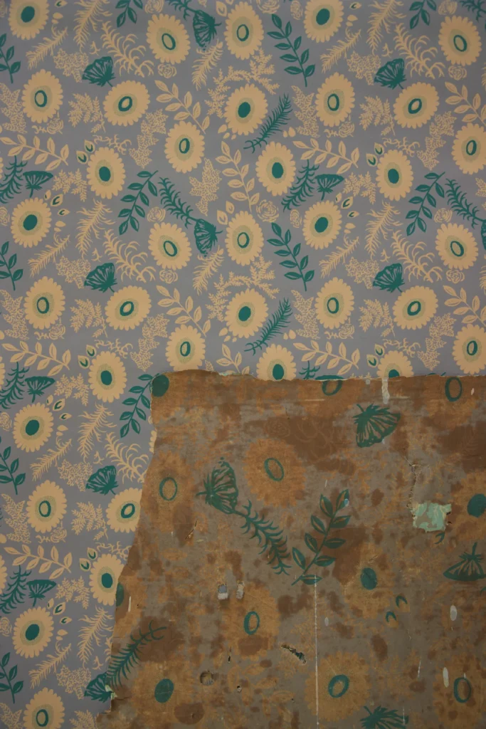
1. Anatomy of a Design: A Scattered Garden Original and GOSATE reproduction of wallpaper 'Youngjah,' discovered in Ganggyeong, South Chungcheong Province.(Photo by Gosate 2025) In the late 1950s to early 1960s, a new kind…

1. Anatomy of a Design: A Scattered Garden
In the late 1950s to early 1960s, a new kind of floral began to appear in the Korean wallpaper market. In place of the heavy, formal damask and peony patterns, lighter and more everyday flowers and leaves started filling the walls. This wallpaper stands at the center of that change.
The central motifs are rounded flowers suggesting a blend of sunflower, daisy, and chrysanthemum, with slender fern-like leaves and grass clusters filling the spaces between them. What defines the composition is its all-over scatter structure — flowers and leaves distributed in all directions without a fixed orientation, giving the entire surface a uniform, easy rhythm. The butterfly silhouettes, drawn in the same hand as the flowers, do more than provide a decorative accent: they breathe movement into an otherwise static pattern.
a low-saturation silver-grey ink is laid down as ground, while the flower areas are left unprinted — allowing the natural yellow tone of the pulp paper to become the flower’s color.
(Source: Collection of Gosate)
The drawing style is closer to illustration than botanical study. Leaf veins and petals are handled with spare lines, and form is established through the contrast of outline and silhouette rather than tonal gradation. The color approach is equally practical: a low-saturation silver-grey ground is printed, with the flower and fern-shaped areas left blank so that the pulp paper’s natural yellow warmth becomes the flower color by default. This is a method with roots in 19th-century woodblock and lithographic printing — a practical choice that minimized ink use while achieving effective color contrast. The addition of green stems and leaves sustains a bright, cheerful tone without harshness.
2. A Turning Point: Shedding Heavy Symbolism for the Everyday
The late 1950s to early 1960s, when this wallpaper was produced, was the period in which Korean society was climbing back from the ruins of war and rebuilding daily life. After the Korean War of 1950–53, people had to begin again in devastated cities — and wallpaper reflected those shifts.
Before and after the war. The 1940s and pre-war years favored authoritative, symbolically weighted patterns: Neo-Gothic crosses, peonies, formal damasks. Everyday florals existed, but heavy ornament dominated. From the mid-1950s onward, the picture changed. Rapid urbanization filled the cities with narrow single rooms, improved hanok, and single-story houses — spaces where light, informal patterns suited the conditions far better than formal decor.
International currents and the spread of technology. This was not a uniquely Korean phenomenon. Across postwar Europe and North America, simplified graphic floral patterns were in wide circulation as part of the broader culture of postwar reconstruction. These currents reached Korea through Japan, and simultaneously, the spread of copper-plate offset printing made such patterns affordable to produce at scale. This wallpaper was born precisely at the intersection of those international trends and technological advances.

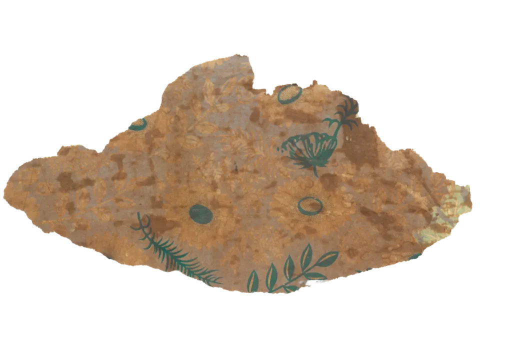
(photo by Gosate 2023)
The new family era. Korea’s baby boom, which began around 1955, brought significant change to the domestic environment. With growing numbers of children and the emergence of the nuclear family, the inner room (anbang) was no longer a space of formality and hierarchy but a warm, living family space. The friendly imagery of flowers and butterflies in this wallpaper fit naturally into a home where children were growing up. It was an era in which the modest, everyday beauty of ordinary life had become more important than solemn symbolic weight.
3. The Balance of Economy and Aesthetic
This pattern is a defining example of the everyday floral — a wallpaper that could be applied without hesitation to a bedroom, a child’s room, or a family living space. The directionless all-over scatter made installation straightforward, and the spare drawing simplified the printing process.
Leaving the flower areas unprinted and allowing the pulp paper’s own color to carry the floral tone was a strategy that saved ink while producing effective color contrast. Two colors — silver-grey and green — were sufficient to generate a bright, pleasing impression. It was a sound choice that achieved both cost efficiency and aesthetic appeal simultaneously.
In the end, this wallpaper holds the image of the homes in which Korea’s postwar baby boom generation was born and raised. It absorbed the international currents flowing from the West and Japan; it reflected the technological realities of affordable mass production; and it gave form, on paper, to the longing of ordinary people for a bright, light, peaceful home after the war. That is precisely what makes it worth preserving.
Copyright © 2026 Gosate Archive.
All Rights Reserved.
- All text and scholarly analysis are the intellectual property of the author.
- All photographs marked “Gosate Collection” or “Photo by Gosate” are the copyright of GOSATE. Reproduction, copying, or distribution without prior consent is strictly prohibited.
- Historical images cited from external sources are subject to their respective copyright holders or public domain provisions.
Inquiries: contact@gosate.kr
More from this era