1. A Design Lineage: From Cathedral to Living Room
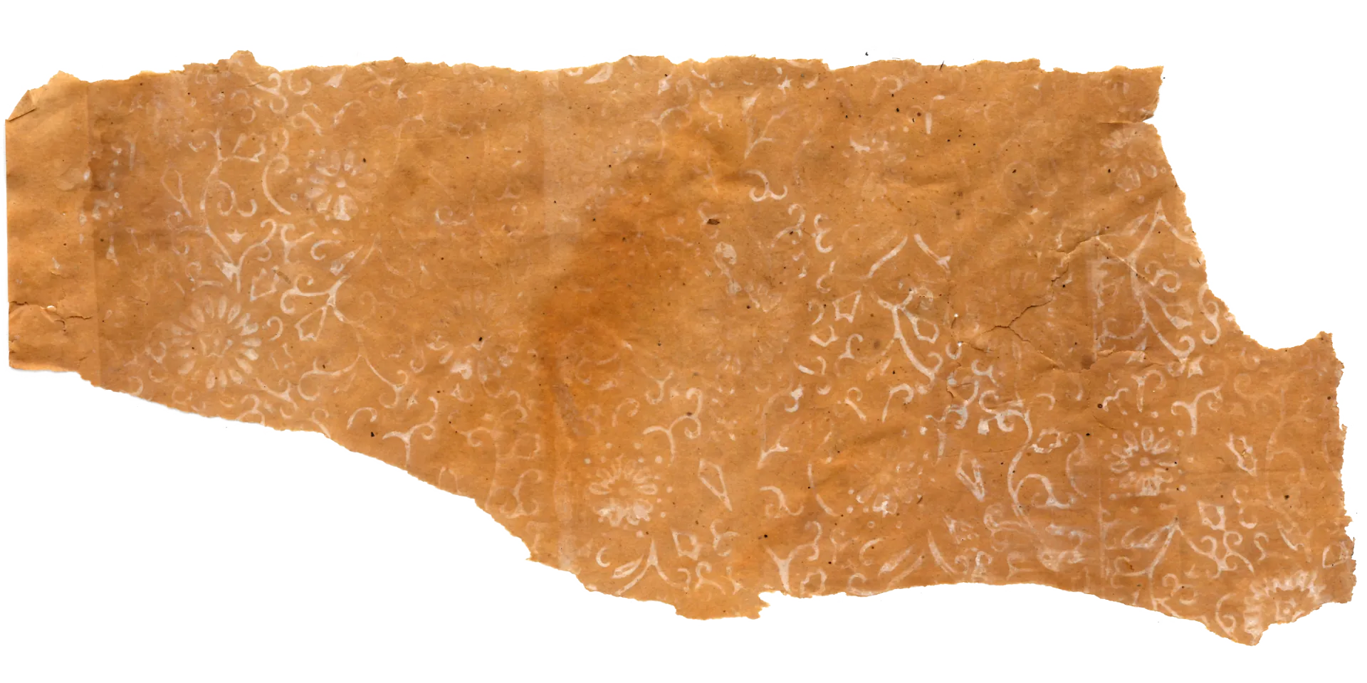
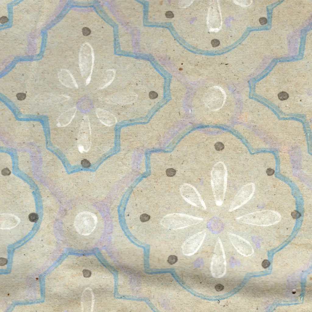
The defining motif of this wallpaper is the quatrefoil — a four-lobed form like a gently pressed four-leaf clover. Within this frame, eight petals radiate outward, surrounded by small dots and lines. These units are arranged in a diagonal grid, generating a rhythmic lattice across the entire wall surface.
(Gosate Collection)
From the Middle Ages to the Victorian Era.
The quatrefoil’s origins reach back to medieval European Gothic architecture. A geometric form commonly seen in cathedral window tracery and cloister floor tiles, it carried associations of the sacred and the ordered. Through the 19th-century Victorian era, however, the pattern shed its religious context and was transformed into secular ornament.
In the mid-19th century, the Gothic Revival movement brought medieval tile patterns into the entrance halls, bathrooms, and kitchens of European middle-class homes — produced as encaustic floor tiles, they became symbols of hygiene and domestic refinement. Wallpaper manufacturers soon printed this “tile feeling” onto paper, creating wallpapers that looked like tile at a fraction of the cost.
20th-Century Mass Production.
By the early 20th century the quatrefoil pattern was being mass-produced in the American wallpaper industry. Through the 1930s–40s in particular, geometric tile-pattern wallpapers of this kind were popular as symbols of the “modern, hygienic interior.” Roller printing technology made them cheap to produce at scale, and combined with pastel colors they projected a bright, cheerful domestic atmosphere.
Notably, a wallpaper produced by the American firm Barnes W.P. Co. in the 1940s has been identified with a pattern completely identical to this Korean wallpaper — differing only in color. The quatrefoil form, the arrangement of interior petals, and the surrounding decorative elements match precisely.
The origins of this structure reach back to the Gothic cathedrals of medieval Europe. This sacred geometry — commonly seen in cathedral window tracery and cloister floor tiles — descended into the domestic spaces of Britain and America through the 19th-century Victorian era. Decorators of the period laid cathedral tile patterns across entrance halls and bathroom floors, and wallpaper manufacturers printed this “tile feeling” onto paper, producing wallpapers that looked like tile.
Notably, a wallpaper produced by the American firm Barnes W.P. Co. in the 1940s has been identified with a pattern completely identical to this Korean wallpaper — differing only in color. The quatrefoil form, the arrangement of interior petals, and the surrounding decorative elements match precisely.
2. To 1960s Korea: A Twenty-Year Lag
The same pattern, a different time.
That the 1940s American pattern and the 1960s Korean pattern are identical is certain. How exactly the design reached Korea is not. It may have been transmitted directly through pattern books or sample sheets, or it may have traveled via Japan, or arrived through some indirect chain of transmission across multiple stages.
What is certain is the twenty-year time lag. A design fashionable in 1940s America was being produced in 1960s Korea. This gap speaks to the pace and pathways of design transmission at the time — international trends did not spread instantaneously, and the disruption of the Korean War (1950–53) would have interrupted and re-routed the flow of design influence.
(Gosate Collection)
The context of 1960s Korea.
The 1960s were a period of rapid urbanization and reconstruction after the war. As narrow hanok, newly built Western-style houses, and row housing multiplied, demand for interior finishing materials grew alongside them. Wallpaper in this period was not simply decoration — it was a symbol of modernity and cleanliness.
Actual tile installation was costly and time-consuming. But a wallpaper printed with a tile pattern was relatively inexpensive and simple to apply. The quatrefoil on a pastel blue ground, white petals blooming across it, created a bright and cheerful atmosphere that aligned precisely with the image people were seeking: “the clean, modern home of an advanced nation.”
3. The Journey of a Pattern
The quatrefoil began as the sacred geometry of the medieval European cathedral, descended through the Victorian era to become the middle-class floor tile, and was transposed onto paper wallpaper for mass production in the early 20th century. Having established itself as everyday decoration in 1940s America, this pattern arrived in 1960s Korea some twenty years later.
The precise route of transmission remains unknown. But the outcome is clear. The same motif was used across different times and spaces, and acquired different meanings in each. In 1940s America it was a convenient ornament of the mass-production age; in 1960s Korea it was a concrete expression of the aspiration toward modernization.
This small four-leaf clover form is quiet evidence of how 20th-century design crossed borders, and how the same shape acquires different meanings in different contexts. From the Middle Ages, across the Atlantic, then across the Pacific, to the walls of a 1960s Korean home — that long journey is held within a single sheet of paper.
Copyright © 2026 Gosate Archive.
All Rights Reserved.
- All text and scholarly analysis are the intellectual property of the author.
- All photographs marked “Gosate Collection” or “Photo by Gosate” are the copyright of GOSATE. Reproduction, copying, or distribution without prior consent is strictly prohibited.
- Historical images cited from external sources are subject to their respective copyright holders or public domain provisions.
Inquiries: contact@gosate.kr