1. The Spirit of the Age: ‘Bright and Fresh’ Sweeps Away the Shadows
This wallpaper is a defining pattern of the late 1960s to early 1970s — a period of rapid transformation in Korean domestic life. It announces, visually, the retreat of the Western Classicist aesthetic absorbed through the Enlightenment era and Japanese colonial period, and the arrival of a new sensibility defined by lightness and cheer.
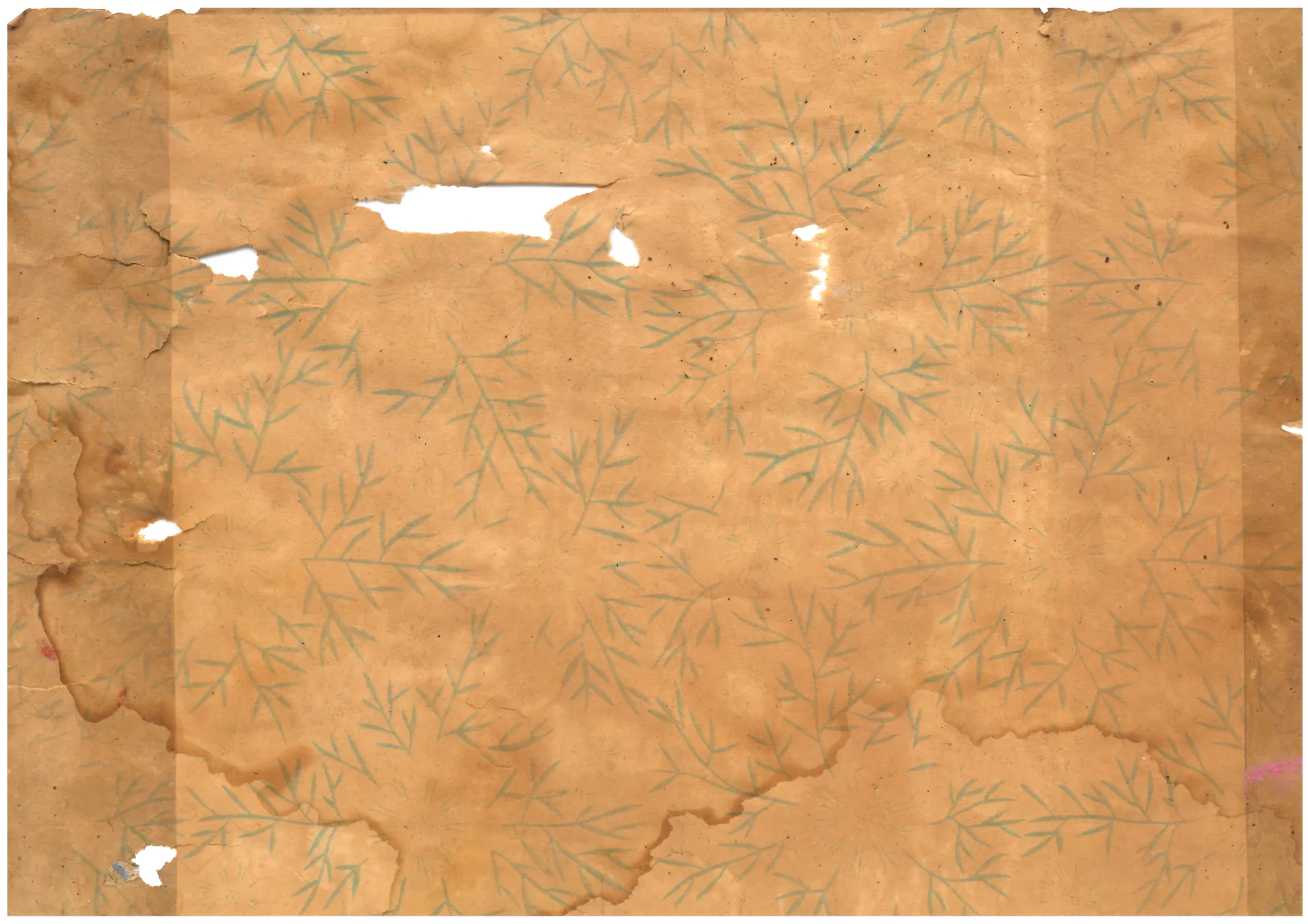
(Photo by Gosate 2025)
What catches the eye first is the sky-blue ground. Against a clear, open blue, olive-colored vines and small flowers in yellow and orange repeat with a buoyant energy. This heightened chroma and brightness is inseparable from the emergence of the yangok (Western-style house) and the urban apartment. People moving from traditional homes governed by earth walls and dark timber into modern residences finished with concrete walls and plywood ceilings wanted something that felt bright and new. A single thin sheet of paper — but the pale blue ground and small cheerful floral motifs were a near-magical tool for making the narrow urban dwelling feel more spacious and sanitary.
Underlying this shift was the influence of international design currents. From the late 1950s onward, the flat, simplified plant motifs of Scandinavian design and Mid-Century Modern swept Europe and North America — entering Korea through the American military presence and imported magazines. The domestic wallpaper industry absorbed these influences and transformed them into a bright florals sensibility calibrated to Korean taste.
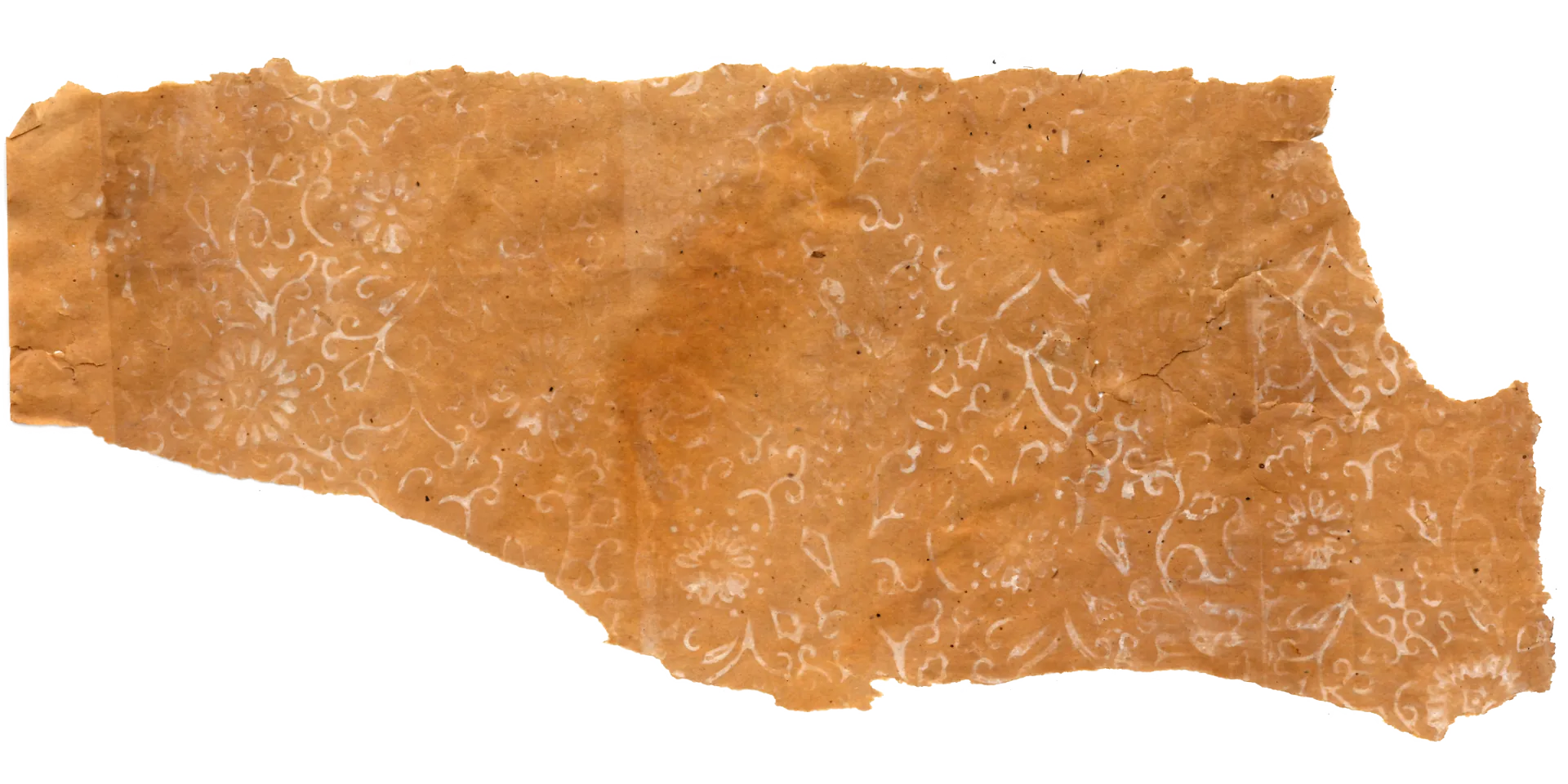
2. A Design in Two Registers: Damask Structure, Nursery Rhyme Spirit
Look closely at the pattern’s underlying structure and an interesting duality emerges. The basic skeleton still connects back to 19th-century European damask: olive stems tracing S-curves that link up, down, left, and right, with a cartouche-like form containing a flower at each interval — unmistakably classical in grammar.
(Source : Gosate Collection)
But what fills that structure has changed entirely. In place of aristocratic acanthus leaves or heavy grape clusters, simplified flower clusters and small dot ornaments straight out of a children’s song have taken their place. The strict frame of the European damask is retained — but refreshed with rhythmic small flowers and light pop colors, reinterpreted for a contemporary eye. This signals that wallpaper was no longer a permanent finish applied once and expected to last decades, but a consumable — replaceable as fashions changed. The inoffensive cheerful damask was the safest, most universally appealing choice available.
3. A Generation Arrives: The Baby Boom Family’s Living Room
Behind this wallpaper’s brightness lies a vast social backdrop: the baby boom generation. As families grew larger, the home was no longer a formal reception room for receiving guests, but a family space where children grew and studied. In this transformation, it was only natural that bright, friendly florals — conducive to a child’s emotional world — were preferred over patterns carrying an air of authority.
In the end, this wallpaper is the product of the damask’s genetic lineage — originating in 19th-century Europe — evolving as it entered the high-growth domestic culture of late 20th-century Korea. The structure wears a familiar Western form, but its color and atmosphere carry the hopeful, spirited energy of 1970s Korean families: the generation of Saemaul and the apartment building.
Copyright © 2026 Gosate Archive. All Rights Reserved.
All Rights Reserved.
- All text and scholarly analysis are the intellectual property of the author.
- All photographs marked “Gosate Collection” or “Photo by Gosate” are the copyright of GOSATE. Reproduction, copying, or distribution without prior consent is strictly prohibited.
- Historical images cited from external sources are subject to their respective copyright holders or public domain provisions.
Inquiries: contact@gosate.kr