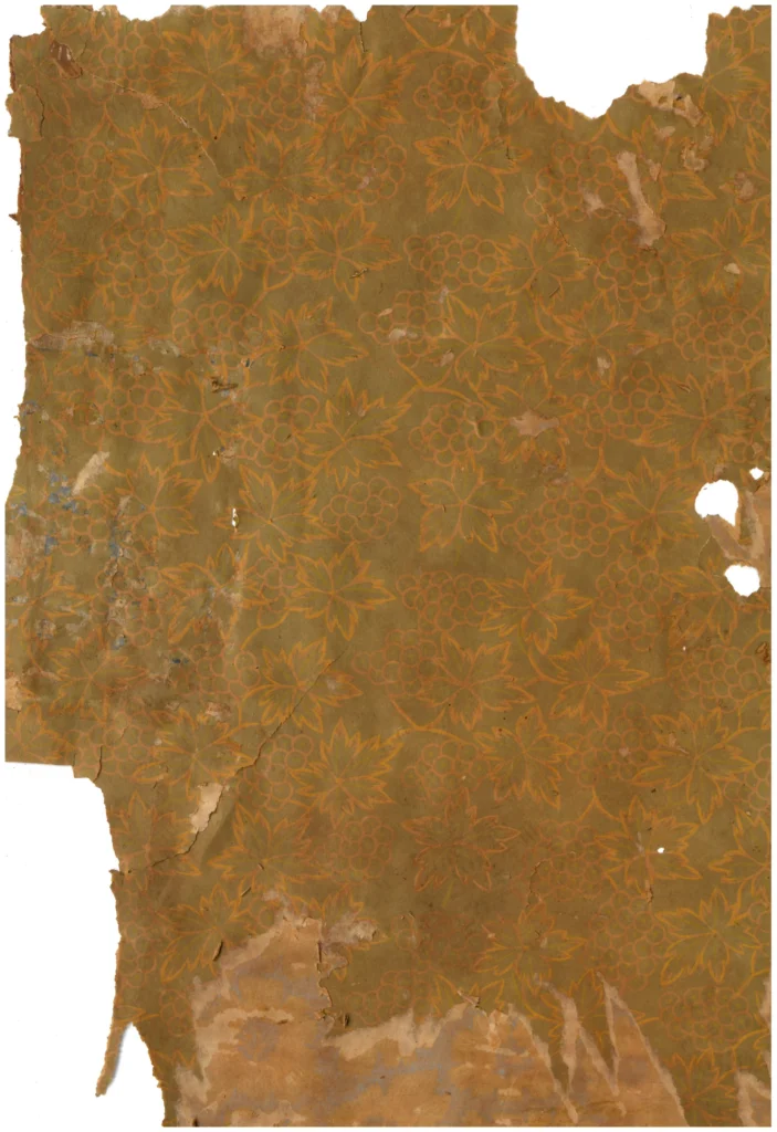
1. An ‘All-Over Vineyard’ Realized in a Single Ink Color
This wallpaper exemplifies a classic early 1960s pattern: grape clusters, leaves, and vines packed densely across the entire surface using a single color of ink. Viewed from a distance, the repeat unit is so tightly constructed that it does not easily read as a mechanical pattern — the whole wall surface registers instead as a single organic plant texture.
(Source: Collection of Gosate)
The grape clusters take a simple form — small circular beads gathered into a bunch — yet the leaf veins and edges are treated with delicate hatching and double outlines, lending the image visual depth. As a result, even in single-color printing, the heavy ink, lighter ink, and the bare white of the paper itself combine to produce at least three distinct tonal values. This creates a trompe l’oeil effect of embossed texture on what is, in reality, a completely flat sheet of plain paper. It is a fine example of the intelligent strategy of early 1960s Korean wallpaper design: achieving maximum visual richness while minimizing ink usage.
2. Two Lineages: Western Festival and Joseon Fertility
The European Decorative Tradition: An Allegory of Abundance and Celebration
In European decorative history, the grapevine has served as a motif symbolizing festivity and vitality — from ancient Roman mosaics to medieval church ornament and early 20th-century textiles. The all-over composition this wallpaper employs faithfully follows that Western decorative lineage, orchestrating a scene like a botanical lace in which small grape clusters and leaves continue without interruption.
The Visual Culture of Joseon: A Record of Fertility and Prosperity
At the same time, the grape held an equally familiar and important place within Korean culture as a subject of auspicious meaning (gilsang, 吉祥). The abundantly hanging clusters symbolized the flourishing of descendants — fertility — and the motif appeared widely across folding screens, embroidery, ceramics, and everyday objects. The neunghwa-pan (菱花板) engraved with grapevine patterns, held in the collection of the National Museum of Korea, is a telling piece of evidence for this tradition. This enduring technique — carving grape motifs into wooden boards and pressing them onto paper to decorate book covers and wall surfaces — formed the formal foundation that allowed the 1960s wallpaper to settle naturally into Korean interiors without a trace of foreignness.
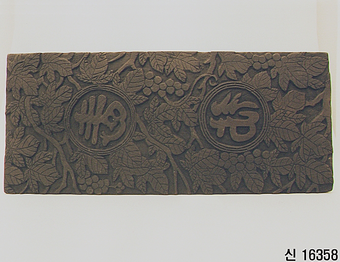
Neunghwa-pan (菱花板) engraved with grapevine pattern.
(Source: National Museum of Korea, Ref. 신수16358, Public Domain Type 1)
3. A Formal Translation: Korean Color Poured into a Western Vessel
The genuine value of this wallpaper lies in its Korean translation of color and scale. The critical choice was to avoid the deep crimson and purple associated with Western wine culture, selecting instead a soft green palette — closer to the dancheong (traditional architectural pigment) and folk painting (minhwa) greens that Korean eyes had long known as their own.
Thanks to this familiar chromatic choice, the grape transcended its associations with any particular religion or Western culture, registering instead as a universal and intimate image of abundance: “a vine full of life” that had always been present in Korean daily experience. This dense plant pattern, which became the everyday background of inner rooms in urban hanok and Western-style houses (yangok) of the early 1960s, stands as an instance of East-West aesthetic hybridization — the assimilation and domestication of a European decorative vocabulary into Korean color sensibility and domestic life.
1960년대 초 도시 한옥과 양옥의 거실, 안방의 일상적인 배경이 되었던 이 촘촘한 식물 패턴은 유럽의 장식 어휘를 한국적인 색감과 생활 감각 안으로 수용하고 정착시킨 사례라 할 수 있습니다.
Copyright © 2026 Gosate Archive. All Rights Reserved.
All Rights Reserved.
- All text and scholarly analysis are the intellectual property of the author.
- All photographs marked “Gosate Collection” or “Photo by Gosate” are the copyright of GOSATE. Reproduction, copying, or distribution without prior consent is strictly prohibited.
- Historical images cited from external sources are subject to their respective copyright holders or public domain provisions.
Inquiries: contact@gosate.kr